User Guide
Comprehensive user guide for the Quantum Payments Portal by Getnet Platforms.
Welcome
Welcome to the Getnet Platforms Portal user guide. This portal empowers you to efficiently manage your organisation's daily payment operations. You can inquire about payment details, check payment statuses, make manual payments, handle any payment exceptions, and export payment information.
The purpose of this guide is to assist you in navigating the portal's functionalities. It is complemented by technical documentation available in the Getnet Platforms Developer Portal.
We hope you find this guide helpful, and we encourage you to provide any feedback directly to your implementation manager.
Quantum security, permissions & roles
How Quantum access control works
Quantum uses Role-Based Access Control (RBAC) integrated with SSO (Azure AD).
To be able to use Quantum, a user must have both:
A Quantum role (assigned through Azure AD group membership; in PRO this is requested via SailPoint), and
Access to at least one Tenant (requested inside Quantum in the Settings section).
If a user doesn’t have an Azure group assigned or doesn’t have access to any Tenant, they won’t be able to use Quantum.
Quantum roles, permissions and Azure AD groups (PRO)
Quantum Role | Key Permissions (summary) | Full Permissions | Azure AD Group (PRO) |
Payment Viewer | View payments & files | View Permission | Quantum_Groups_ViewerOnly_PRO |
User management | Manage tenant users | View Permission, User management Permission, Download Excel | Quantum_Groups_User_management_PRO |
Manual payment operator | Create manual payments | View Permission, Manual payments, Download Excel | Quantum_Groups_Manual_payments_operator_PRO |
Payment operator (editor) | Operate on payments (no authorization) | View Permission, Release Permission, Reject Permission, Repair Permission, Reprocess Permission, Cancel a payment, Recall request, Download Excel | Quantum_Groups_Hospital_PRO |
Payment manager | Full payment operations incl. authorization | View Permission, Release Permission, Reject Permission, Repair Permission, Reprocess Permission, Cancel a payment, Recall request, Authorize Permission, Download Excel | Quantum_Groups_Payment_manager_PRO |
Fraud Operator (compliance) | Manage fraud‑stopped payments | View Permission, Fraud Permission, Download Excel | Quantum_Groups_Compliance_PRO |
Business Profile | Business view of payments/files & dashboards | View Permission (just for payments and files), Download Excel, Business dashboards | Quantum_Groups_Business_Profile_PRO |
Auditor Profile | Read‑only audit view | View Permission (just for payments and files), Download Excel | Quantum_Groups_Auditor_Profile_PRO |
IT Profile | Technical / IT view (anonymised data) | View Permission (anonymized sensible information) | Quantum_Groups_IT_Profile_PRO |
Mandate store viewer | View mandates | Mandate_Store_View | Quantum_Groups_Mandate_Store_Viewer_PRO |
Mandate store operator | Maintain mandates | Mandate_Store_View, Mandate_Store_Operator | Quantum_Groups_Mandate_Store_Operator_PRO |
Mandate store approval | Approve mandate changes | Mandate_Store_View, Mandate_Store_Operator, Mandate_Store_Approval | Quantum_Groups_Mandate_Store_Approval_PRO |
Disputes MED Viewer | View disputes (PIX) | Disputes view permissions (local PIX) | GR_Quantum_Groups_DisputesViewer_PRO |
Disputes MED Operator | Operate disputes (PIX) | Disputes operation permissions (local PIX) | GR_Quantum_Groups_Disputes_PRO |
Tenant Configurations | Configure tenant dashboards | View Permission, Dashboard Edition | GR_Quantum_Groups_Tenant_Configurations_PRO |
Getting access to Quantum
Quantum works integrated with SSO Azure AD. So to get access to Quantum, the user will use a corporate mail.
The access to the platform consist of 2 steps
get the role through Azure groups – this is requested by the user or the user’s manager via Sailpoint
grant access to one or several Tenants
the user can request access to a tenant during the first login
or a Quantum user with user management admin rights can directly create the user in Quantum and assign it to the right tenant
If a user does not have a group assigned via Sailpoint or does not have access into a Tenant via Quantum will not be able to use Quantum.
Request access to Quantum groups via Sailpoint
Request access to Quantum groups via Sailpoint
The access to production is managed by Sailpoint, to get access you need to go to Sailpoint. In the left corner click on the menu and then enter in the menu option:
Manage user access
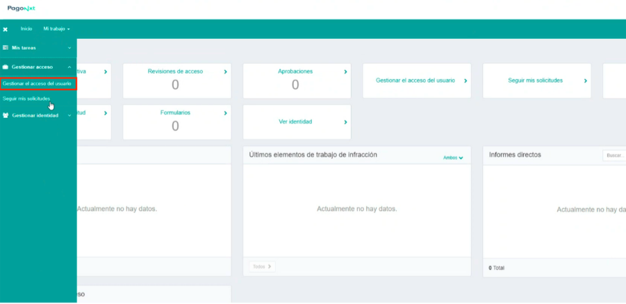
Follow these steps
Introduce your email and click on next
Introduce one of the Groups listed above under Azure AD Group (PRO) and click next.
First Login – tenant association
First Login – tenant association
During the onboarding process, your organisation will establish an authentication method with Getnet Platforms, known as Single Sign-On (SSO). This process uses your corporate email and password, which you will use each time you log into the portal. The SSO procedure is essential, as it guarantees that only authorised users can access the information and tools available within the portal. This approach helps maintain the security and integrity of the data, safeguarding sensitive information from unauthorised access.
During the first connection to Quantum (or if a user is removed from all tenants), the user is taken to the following flow:
Step 1: Select tenant(s) to enrol.
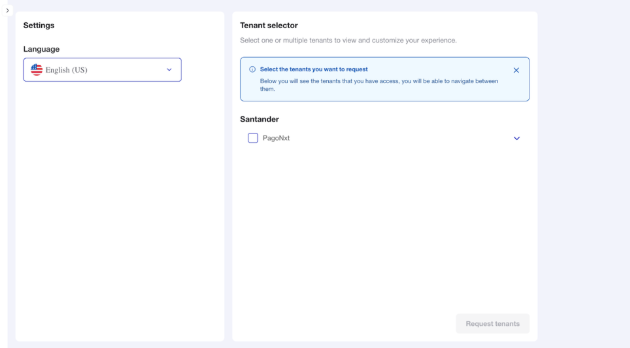
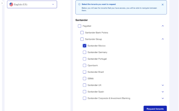
Step 2: Confirmation of tenant request
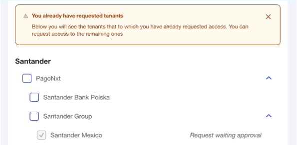
Step3: An email also confirms the request
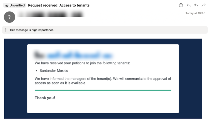
Step 4: An email is also sent to the user managers of the tenants
.png)
Step 5: Upon clicking in the email link, the user manager is taken to Quantum and pending requests to Approve/Reject are shown
.png)
Step 7: Once the user manager approves the request, the user receives a confirmation email and is ready to login and operate in Quantum.
.png)
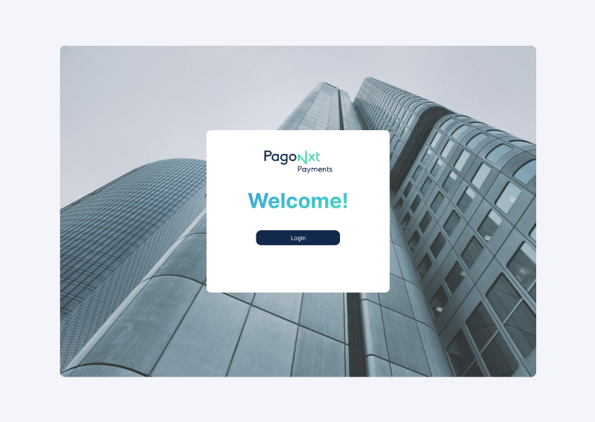
Step 8: Navigate to the URL you were given by your client service team via the web browser to access the customer portal website. A welcome screen such as the following will appear:
First Login
Click ‘Login’ and enter a valid corporate email and password and click on the second ‘Login’ button.
Once the credentials have been validated, the home screen will appear and a confirmation of your active profile will appear in the top right corner.
Any errors during the login process will automatically pop up e.g. invalid credentials.
Homepage
An overview of the Quantum homepage — the central monitoring screen for payment operators and managers to track current-day activity.
Step 1: Homepage Overview
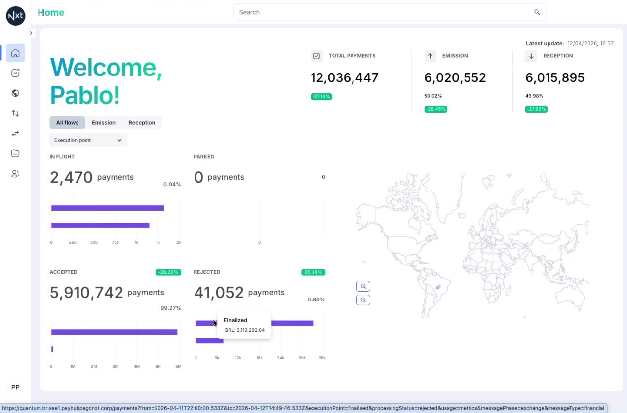
The Homepage is the first screen you see when you log in to Quantum. Its purpose is to allow payment operators and managers to monitor current-day activity at a glance.
The homepage displays payments processed from midnight today to the current time. The date picker on this screen is not selectable — data is always for today only.
All values on the homepage are governed by the selected tenant (shown in the top-right corner) and the flow filter tabs.
.png)
Step 2: Payment Totals and Breakdown
At the top of the homepage, you can see the Total Payments count along with a split between:
Emission — payments sent out
Reception — payments received
Each shows the count and percentage. These numbers represent all payments processed during the current day.
.png)
Step 3: Flow Filters
Below the totals, you will find three filter tabs: All flows, Emission, and Reception.
Clicking on any of these tabs updates the entire screen — the status buckets, bar charts, and all other values adapt to show data for the selected flow only.
Step 4: Payment Status Buckets
The homepage displays four main status buckets representing the core processing states of a payment:
In Flight — payments currently being processed (transitory state)
Parked — payments that require attention or manual intervention (transitory state)
Accepted — payments that have been successfully processed (final state)
Rejected — payments that have been declined or failed (final state)
In Flight and Parked are transitory statuses — payments remain there temporarily before moving to a final state. Accepted and Rejected are the two main final statuses.
Step 5: Bar Charts and Breakdown
Each status bucket includes a bar chart that provides a breakdown by important attributes. For example, the Rejected bucket breaks down rejected payments into sub-categories such as Finalized vs. Sent to scheme.
These charts give you a quick visual understanding of the distribution within each status category.
.png)
Step 6: Interacting with Chart Elements
Every element on the homepage is clickable:
Clicking on a status bucket (In Flight, Parked, Accepted, Rejected) navigates you to the Payment List pre-filtered by that status
Clicking on a specific bar in a chart navigates to the Payment List filtered by that particular sub-status
Hovering over chart bars shows a tooltip with the exact count for that category.
Tip: Use the clickable elements to quickly drill down from the homepage overview into specific payment lists.
Step 7: Navigating to the Payment List
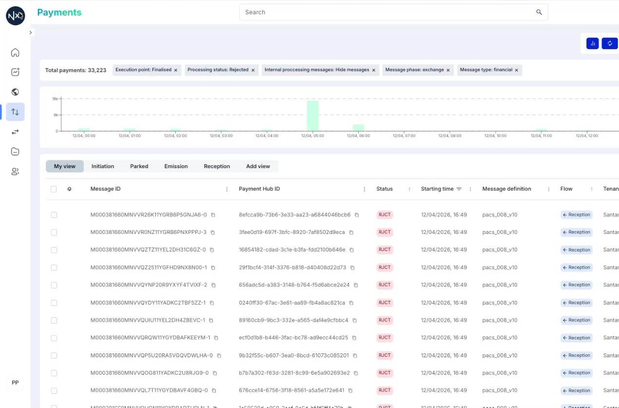
When you click on any clickable element (a status count, a bar, or a percentage), the system navigates you directly to the Payment List with the appropriate filters already applied.
For example, clicking on the "Finalized" bar in the Rejected chart takes you to a payment list showing only finalized rejected payments.
Quick Reference
Step | Action |
|---|---|
1 | Homepage shows current-day payment activity (midnight to now) |
2 | View Total Payments split between Emission and Reception |
3 | Use flow filter tabs (All flows, Emission, Reception) to update all data |
4 | Four status buckets: In Flight, Parked, Accepted, Rejected |
5 | Bar charts show breakdown within each status category |
6 | Click any element to drill down to the filtered Payment List |
Service Insights and Notifications
Monitor automated insights about your tenant's payment processing trends, and access notification alerts from the homepage.
Step 1: Service Insights Panel
On the right side of the homepage, you will find the Service Insights panel. This is a new feature that provides automated insights about your tenant’s payment processing trends.
These insights are triggered by alerts configured in the system and give you important information about changes in your payment activity. For example:
"Payments volume has increased by 3% over the last month"
"Total amount volume has increased by 8% over the last month"
"Rejected payments volume has increased by 95% from yesterday"
Tip: Service Insights are generated automatically based on system-configured alert thresholds. They help you spot trends and anomalies without manual analysis.
.png)
Step 2: Reviewing Insight Details
Each insight card shows a summary of the trend including the metric name, the percentage change, and the comparison period (e.g., "over the last month" or "from yesterday").
The insights update automatically as new data is processed throughout the day, giving you a real-time view of how your payment processing compares to historical patterns.
Step 3: Notification Bell
Next to the Service Insights, you will find the notification bell icon in the top-right area of the homepage. Clicking on it opens a Notifications panel.
.png)
When there are new notifications, they will be displayed here. From this panel, you can access more details about each notification.
Tip: If the panel shows "There are no data to display", it means there are no pending notifications for your tenant at this time.
.png)
Quick Reference
Step | Action |
|---|---|
1 | Service Insights panel appears on the right side of the homepage |
2 | Insights are auto-generated from system alerts about payment trends |
3 | Review each insight card for trend details and percentage changes |
4 | Click the notification bell to view pending notifications |
Assigning Payments
Assign parked payments to yourself or team members for tracking and resolution, and monitor assignment activity.
Step 1: Assigned Payments on the Homepage
When you log in to the homepage, you will see an Assigned payments box on the right side. This shows:
The total number of payments currently assigned to you
A breakdown by parked status type (for example, "Accounting Exception")
Clicking on a specific status type (e.g., "Accounting Exception") takes you directly to the payment list filtered to show only those assigned payments.
.png)
Step 2: Viewing the Assign Column in the Payment List
In the Payment List, parked payments that are in the exception handler display an assignment column. This column shows:
A grey icon — the payment is not assigned to anyone
A dark blue bubble with initials — the payment is assigned to you
A light blue bubble with initials — the payment is assigned to a colleague
Note: Not all parked payments can be assigned. Only payments in the exception handler show the assignment icon.
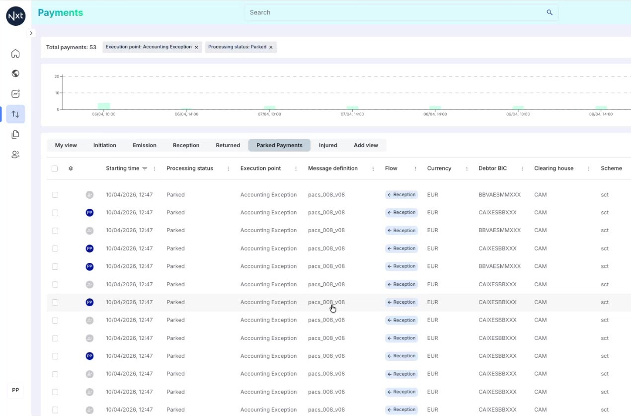
Step 3: Assigning a Payment to Yourself
To assign a payment to yourself, simply click the grey assignment icon on any unassigned payment in the list. The system immediately assigns the payment to the currently logged-in user.
After clicking, the icon changes to a dark blue bubble showing your initials, confirming the assignment.
Tip: You can assign or unassign a payment in one click directly from the payment list.
.jpeg)
Step 4: Understanding Assignment States
Once payments are assigned, you can visually distinguish between different assignment states:
Dark blue bubble with your initials — assigned to you
Light blue bubble with another person’s initials — assigned to a colleague
Grey icon (no initials) — unassigned
No icon at all — the payment is parked but not in the exception handler and cannot be assigned
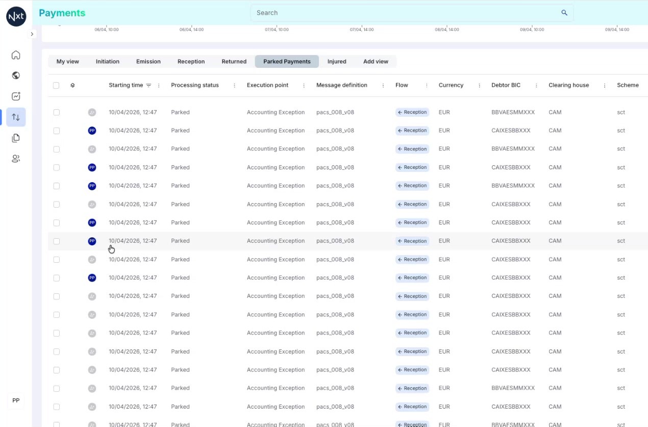
Step 5: Assignment Activity in Payment Details
When you open a payment’s detail view, you can see:
The "Assigned to" label showing who the payment is currently assigned to
In the User Activity section at the bottom, a log entry recording when the payment was assigned or unassigned
Every assign and unassign action is recorded in the user activity, providing a full audit trail of payment assignments.
Quick Reference
Step | Action |
|---|---|
1 | Check the Assigned Payments box on the homepage for your assignments
|
2 | In the Payment List, look for the assignment column on parked payments |
3 | Click the grey icon to assign a payment to yourself |
4 | Dark blue = assigned to you, light blue = assigned to colleague, grey = unassigned |
5 | All assignment actions are recorded in the User Activity audit trail |
.jpeg)
Payment List
Use the Payment List to monitor, filter, select, and export payments — the main operational tool within Quantum.
Step 1: Payment List Overview
The Payment List is one of the main tools within Quantum. It is the central place where you can see, monitor, and filter payments for your tenant.
By default, the system shows a list of 25 items per page, along with the total number of payments retrieved for the current filters and time range.
.png)
Step 2: Toolbar Controls
At the top of the Payment List, you will find the following toolbar controls:
Histogram toggle — Show or hide the histogram chart above the list
Refresh button — Reload the payment data
Date range picker — Select the time period (default: last 7 days)
Filters — Add or modify filters to narrow down payments
Columns — Choose which columns to display in the list
.png)
Step 3: Selecting Individual Payments
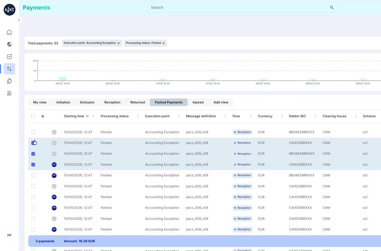
You can select payments individually by clicking the checkbox next to each payment row. When you select a payment, a selection bar appears at the bottom showing:
The number of payments selected
The total amount of the selected payments
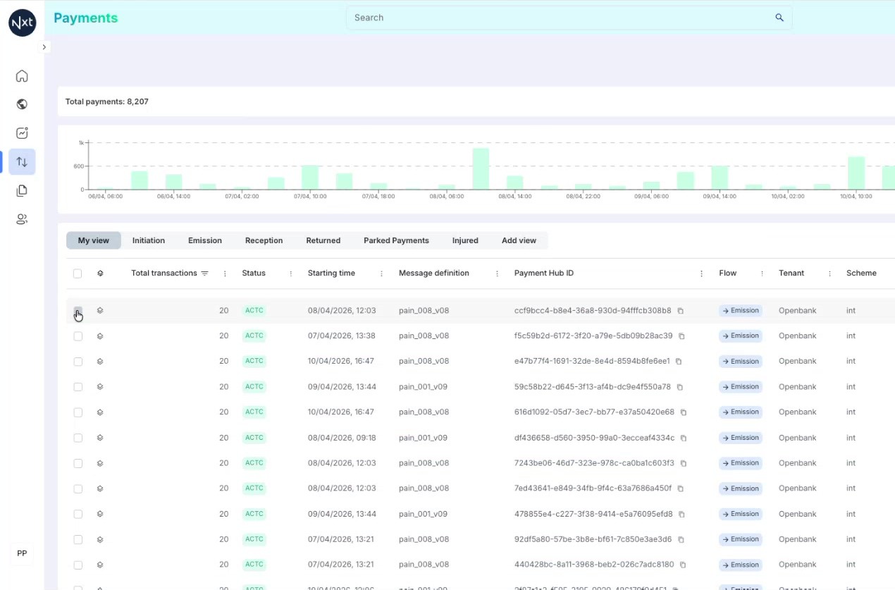
Step 4: Multiple Payment Selection
Select multiple payments by clicking additional checkboxes. The selection bar updates in real time, showing the cumulative count and total amount of all selected payments.
This is useful for reviewing a batch of related payments or preparing a bulk action.
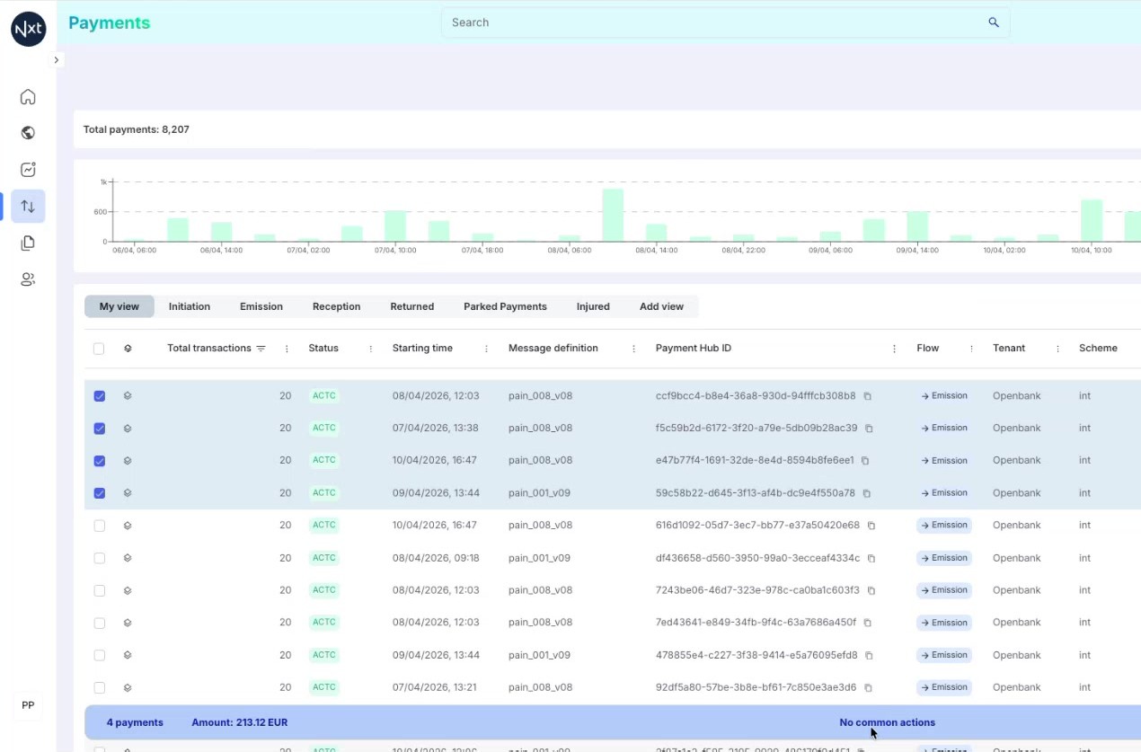
Step 5: Bulk Actions on Selected Payments
When you have parked payments selected that support actions, the selection bar displays available bulk actions. For example, you may see a Reprocess button that lets you reprocess all selected payments at once.
Bulk actions save time when you need to perform the same operation on multiple payments simultaneously.
Tip: Bulk actions are only available for payments in specific statuses (e.g., parked). The available actions depend on the payment type and status.
Step 6: Exporting Payments to Excel
To export the current payment list to an Excel file, click the Export button in the toolbar area. The system generates an Excel file containing the payment data based on your current filters and visible columns.
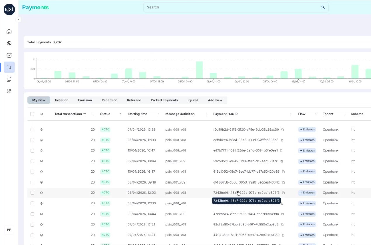
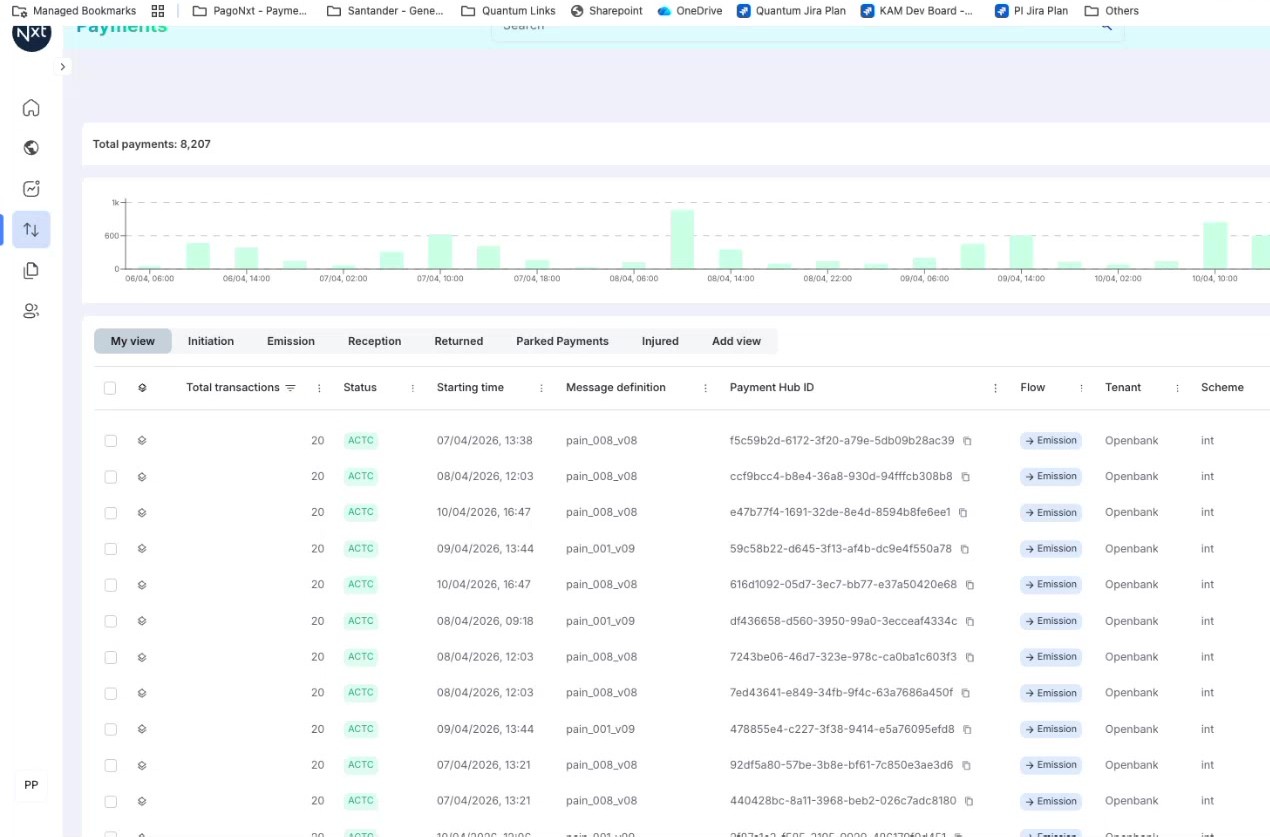
Step 7: Exported Excel File
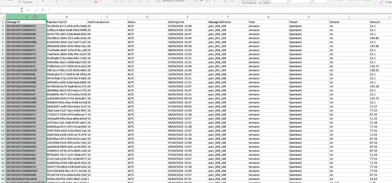
The export generates an Excel file that is automatically downloaded to your computer. The file contains the same data visible in the Payment List, including all the columns you have selected.
Step 8: Reviewing Exported Data
Open the downloaded Excel file to see the payment data in spreadsheet format. This is useful for:
Offline analysis — work with the data in your preferred tools
Reporting — share payment information with stakeholders
Record keeping — maintain a snapshot of payment data at a specific point in time
The Payment List now shares the same filter experience as dashboards. Add these steps to the Payment List article (after “Step 2: Toolbar Controls”).
Advanced Filtering — Step 1: Open the Filters Panel
Click Filters in the top-right of the Payment List. The filter experience has been homogenized with dashboards and redesigned around three columns: Field, Operator and Value. The Total payments count at the top-left always reflects the filters currently applied.
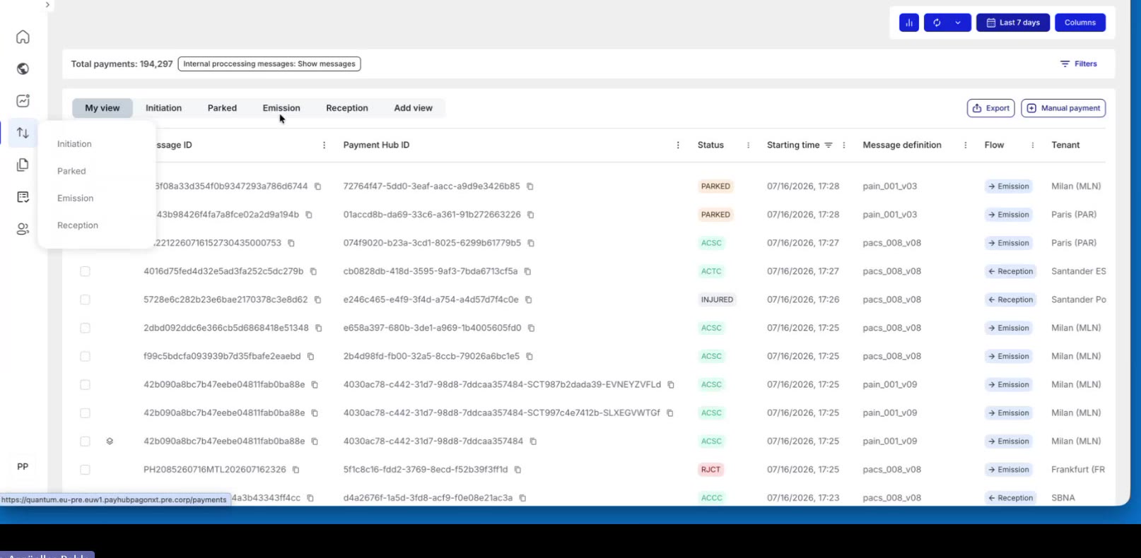
Advanced Filtering — Step 2: Choose a Field
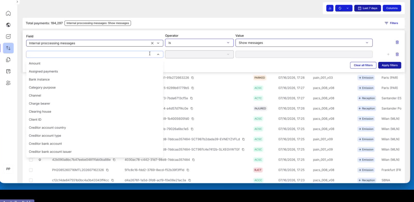
Open the Field dropdown to see every attribute available from the payment data model — Amount, Client ID, Product, Scheme, Flow, and many more. Start typing to search the list and quickly jump to the field you need.
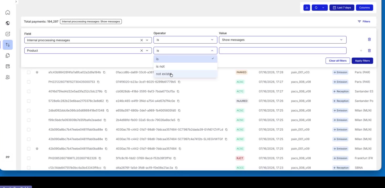
Advanced Filtering — Step 3: Pick an Operator (including negative operators)
After selecting a field, choose an Operator. The available operators depend on the field’s data type. For a text field you can choose:
Is — keep records that match the value.
Is not — exclude records that match the value (negative filter).
Not exists — keep records that have no value in that field.
For other field types, like amounts or dates, other operators like less than, bigger than or range dates selection operators are available.
Advanced Filtering — Step 4: Set the Value and Add More Conditions
Enter or select the Value for the condition. Click + to add another Field / Operator / Value row — conditions compound together, so you can mix positive and negative filters. Click Apply filters to update the list.
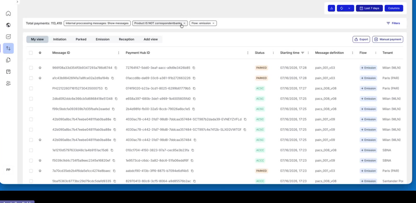
In the example below, Product Is not correspondentbanks reduces the total from 194,297 to 145,164 payments, and the applied filter appears as a chip at the top.
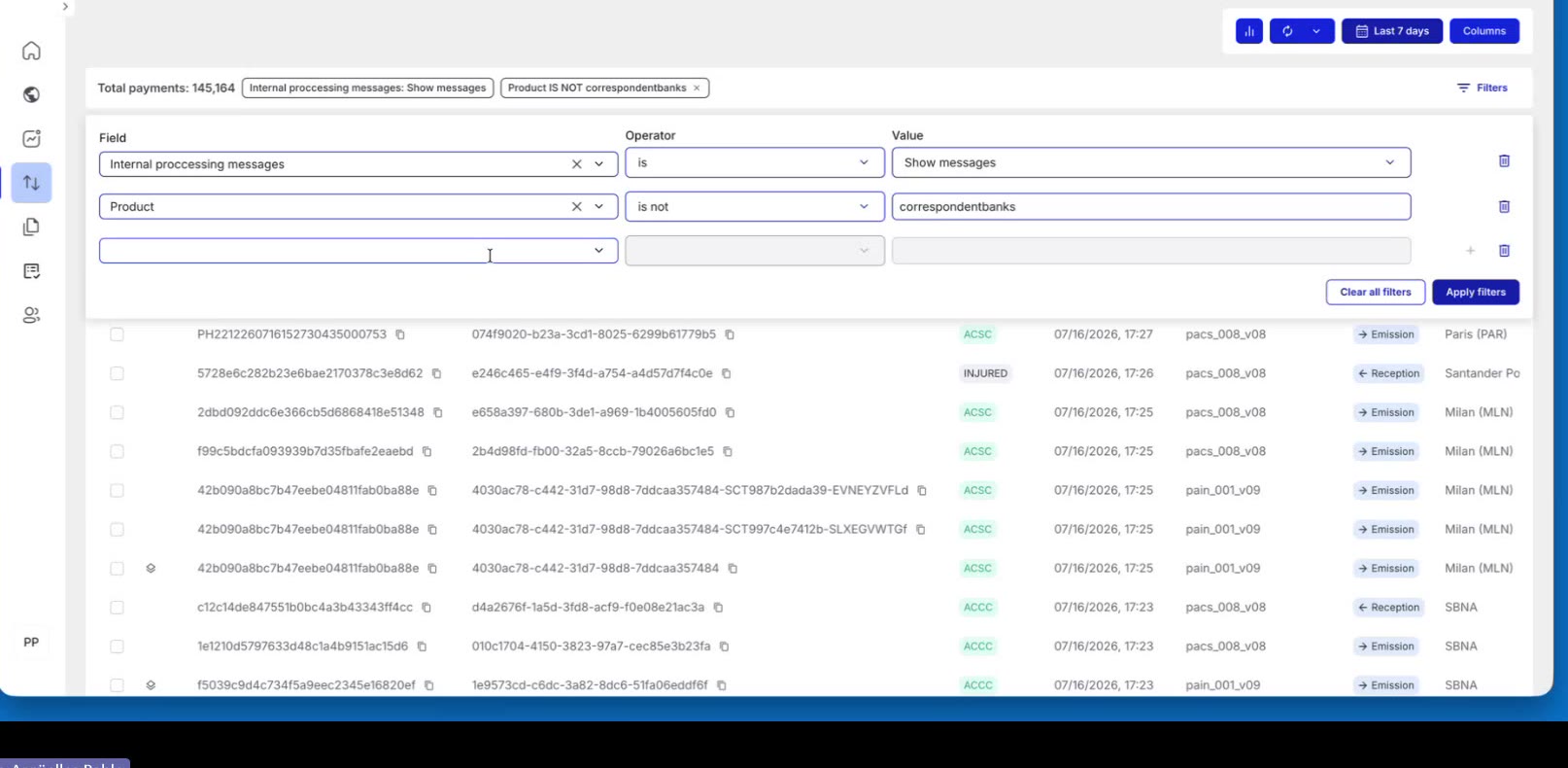
Advanced Filtering — Step 5: Work with Filter Chips
Applied filters appear as chips above the list (for example, Product IS NOT correspondentbanks and Flow: emission). Each chip shows the value being applied. Click a chip to edit its value, or click its × to remove that condition. The Total payments count updates instantly as you add or remove filters.
Custom Views
Create, save, duplicate, export, import, and delete custom views in the Payment List to personalize your monitoring workflow.
Step 1: Understanding Views
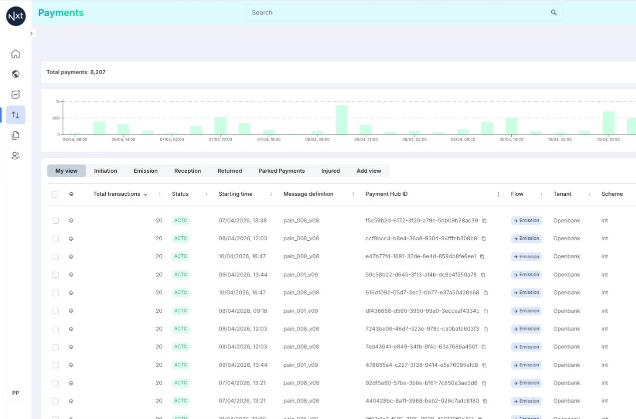
The Payment List supports custom views — saved configurations of filters, columns, and display settings that you can switch between using tabs at the top of the list.
Views allow you to quickly switch between different perspectives of your payment data without having to reconfigure filters and columns each time.
Step 2: Default and Custom Views
The system provides default views that are available to all users. In addition, you can create your own custom views tailored to your specific monitoring needs.
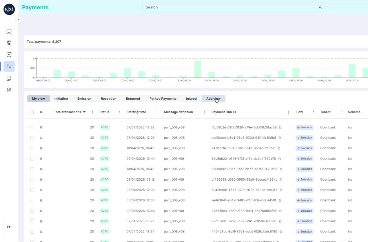
Both default and custom views appear as tabs at the top of the Payment List. Click on any tab to switch to that view.
Step 3: Using a Custom View
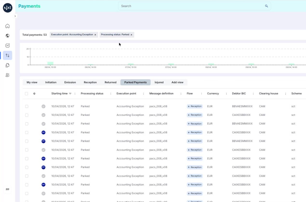
When you select a custom view, the Payment List automatically applies the saved filters and column configuration for that view. For example, a "Parked Payments" view might pre-filter to show only parked payments with specific columns relevant to exception handling.
Step 4: Creating a New View
To create a new custom view, click the Add View button (+ icon) in the tabs area. A dialog appears where you can enter a name for your new view.
Type a descriptive name and click Create. The new view starts with the default configuration, which you can then customize.
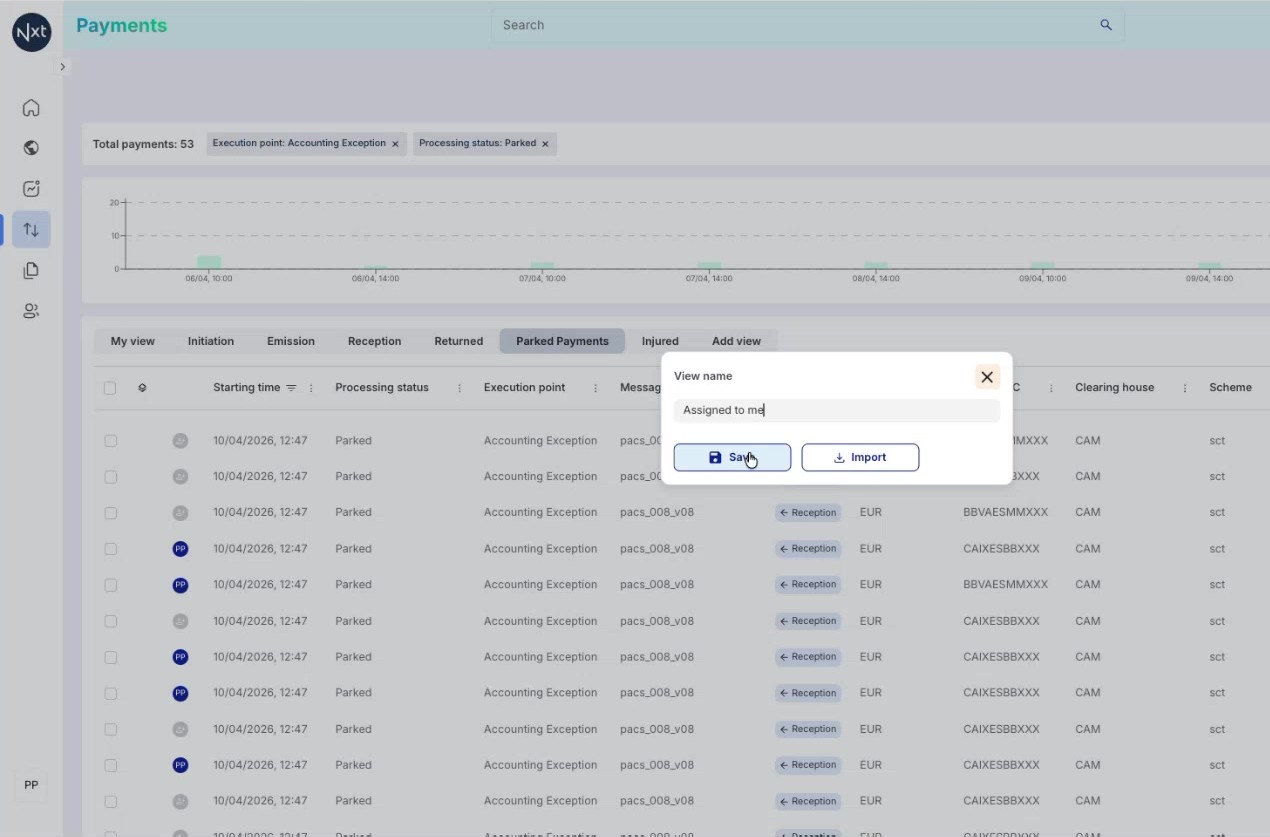
Step 5: Configuring View Filters
After creating a new view, customize it by adding filters. Click the filters button in the toolbar and configure the conditions you want. For example, you might filter by processing status, payment scheme, flow direction, or any other available attribute.
Step 6: Configuring View Columns
You can also customize which columns are displayed in your view. Click the columns button in the toolbar to open the column selector. Add or remove columns such as payment code, message ID, or other fields relevant to your workflow.
.png)
Step 7: Unsaved Changes Indicator
When you make changes to a view’s filters or columns without saving, an amber dot appears next to the view tab name. This indicator tells you that you have unsaved changes.
Tip: Always save your view after making changes to ensure they persist for your next session.
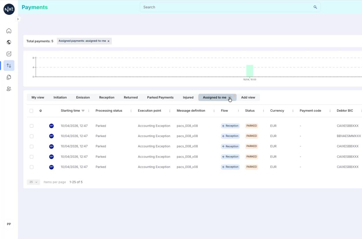
Step 8: Saving a Custom View
To save your changes, click the three-dots menu (⋯) next to the view tab and select Save. A confirmation message appears indicating that the view has been successfully saved.
From now on, every time you select this view, it will load with the saved filters and column configuration.
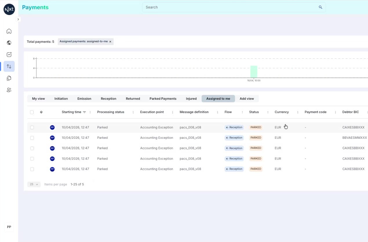
Step 9: View Options Menu
The three-dots menu (⋯) on each custom view tab provides several options:
Save — Save the current filter and column configuration
Duplicate — Create a copy of the view with the same configuration
Export — Export the view configuration as a JSON file
Delete — Permanently remove the view
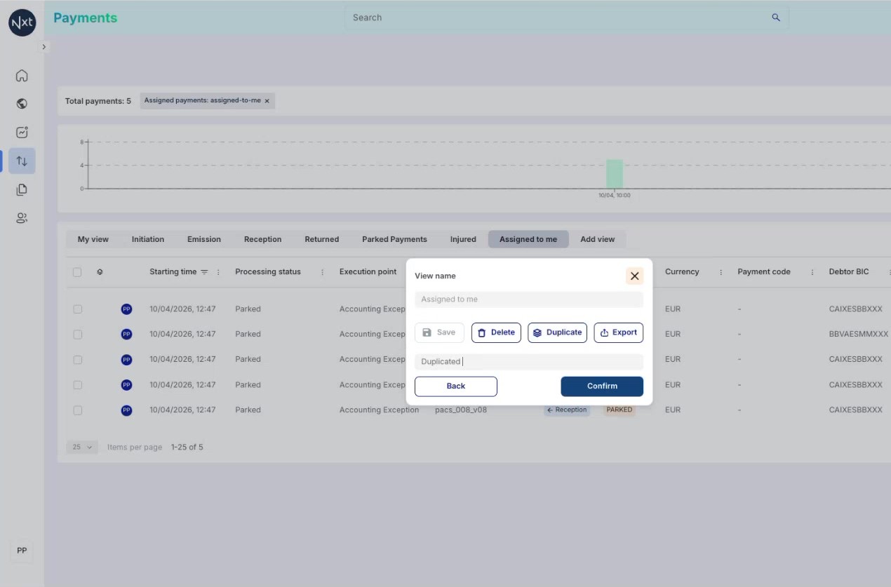
Step 10: Duplicating a View
Select Duplicate from the view options menu to create an exact copy of the current view. The duplicated view appears as a new tab with a new name.
This is useful when you want to create a similar view with slight modifications without losing the original configuration.
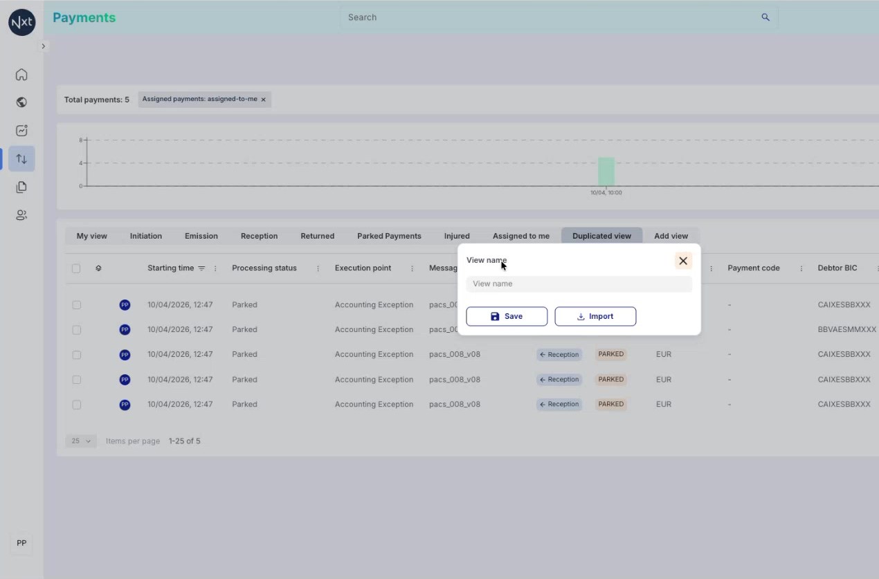
Step 11: Exporting and Importing Views
To share a view configuration, select Export from the view options. The system generates a JSON file containing the complete view configuration.
To import a view, click the Add View button and select Import instead of typing a name. Browse to the JSON file, select it, and click Import. If the view name already exists, you will be prompted to rename it.
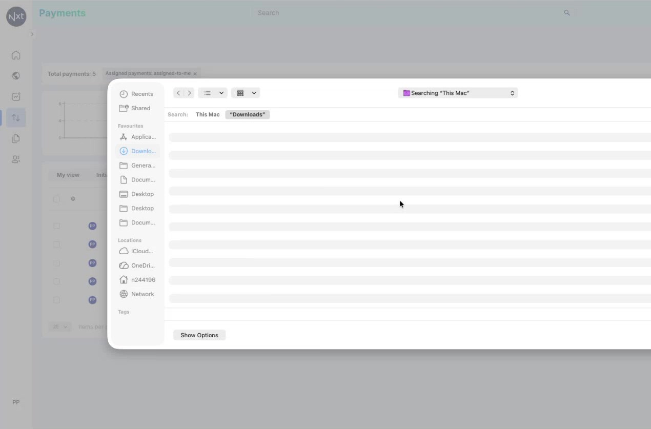
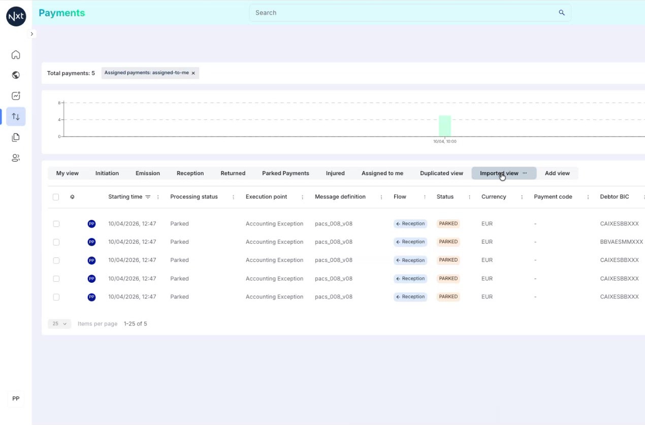
Step 12: Imported View Created
The imported view appears as a new tab with the same configuration as the original export. It will have the filters, columns, and all settings from the exported JSON file.
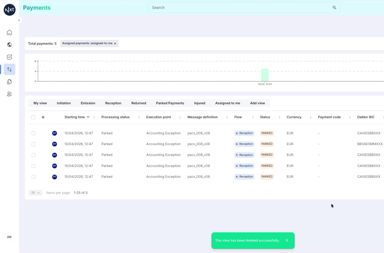
Step 13: Deleting a Custom View
To remove a custom view, click the three-dots menu (⋯) on the view tab and select Delete. Confirm the action when prompted.
You can also delete duplicate or imported views that are no longer needed to keep your tabs clean and organized.
Note: Deleting a view is a non-reversible action. Consider exporting the view first if you might need it later.
Quick Reference
Step | Action |
|---|---|
1 | Custom views save filter and column configurations as named tabs |
2 | Click Add View to create a new view with a custom name |
3 | Configure filters and columns, then Save from the three-dots menu |
4 | Amber dot indicates unsaved changes on a view |
5 | Duplicate a view to create variants with slight modifications |
6 | Export views as JSON to share; Import to restore from JSON |
7 | Delete views from the three-dots menu (non-reversible) |
Payment Details
Explore the Payment Details view — one of the most important views within Quantum — to review payment information, statuses, audit events, and perform actions.
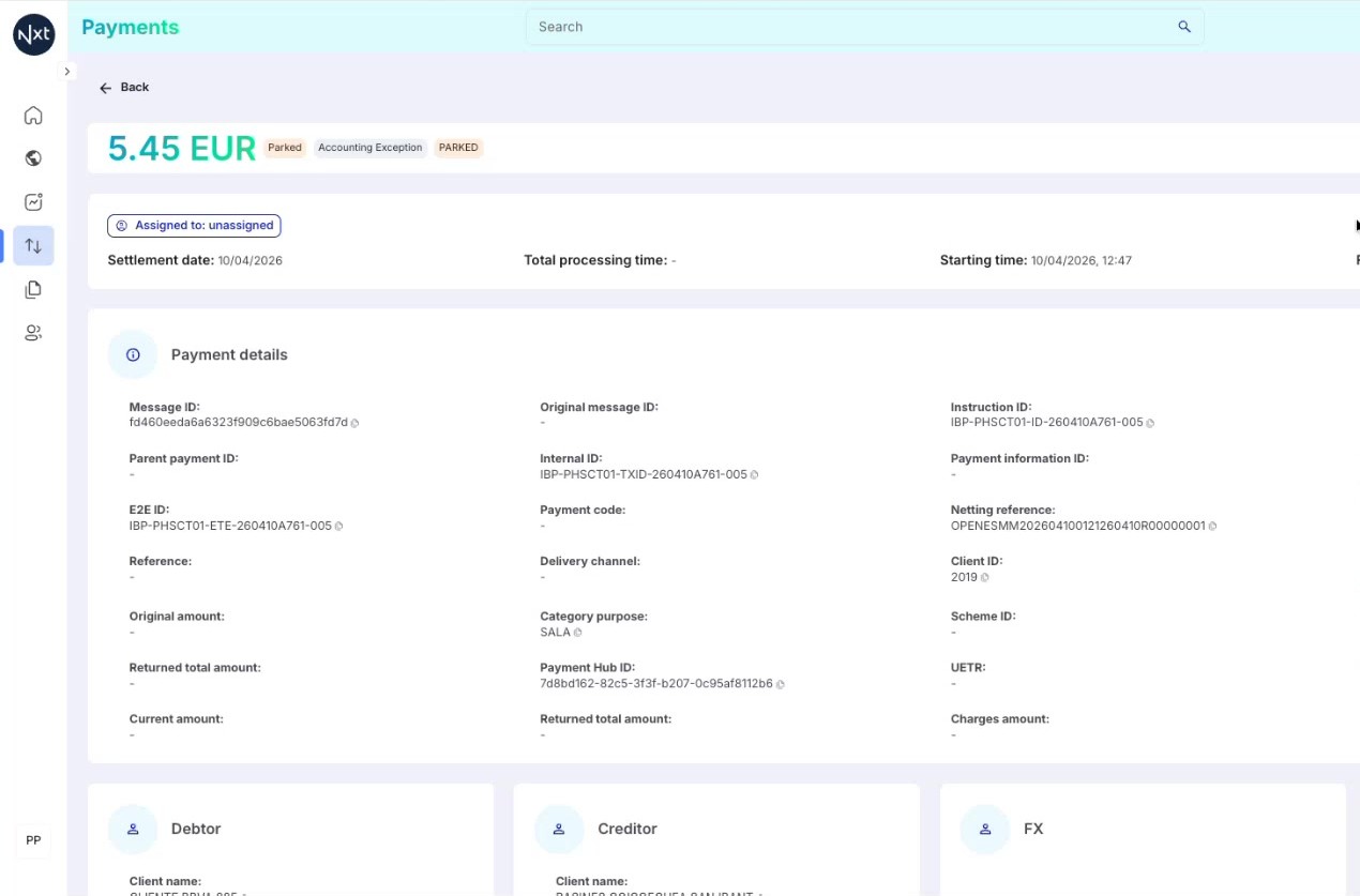
Step 1: Opening a Payment
From the Payment List, click on any payment row to open the Payment Details view. This is one of the most important views within Quantum, providing a comprehensive view of all information related to a specific payment.
Step 2: Payment Details Overview
The Payment Details view displays the following main sections:
Payment amount and currency — displayed prominently at the top
Status chips — colored labels showing the payment’s processing status, sub-status, and functional status
Assignment information — shows whether the payment is assigned and to whom
Key dates — settlement date, starting time, finishing time, and total processing time
Step 3: Status Chips and Tooltips
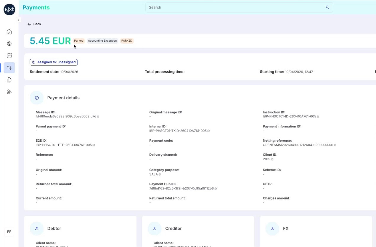
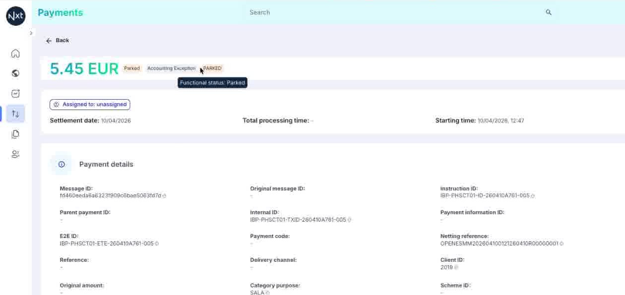
The status chips at the top provide a quick summary of the payment’s state. Hovering over a chip shows a tooltip with additional details.
For example, hovering over a status chip may reveal the functional status (e.g., "Functional status: Parked") along with any associated codes such as payment codes or rejection codes.
Tip: Status codes and rejection codes provide important context for understanding why a payment is in its current state.
Step 4: Times and Assignment Section
Below the status chips, you will find key timing information:
Settlement date — when the payment is scheduled to settle
Total processing time — how long the payment took to process
Starting time — when the payment entered the system
Finishing time — when processing completed
The "Assigned to" label shows the current assignment status of the payment.
Step 5: Payment Detail Fields
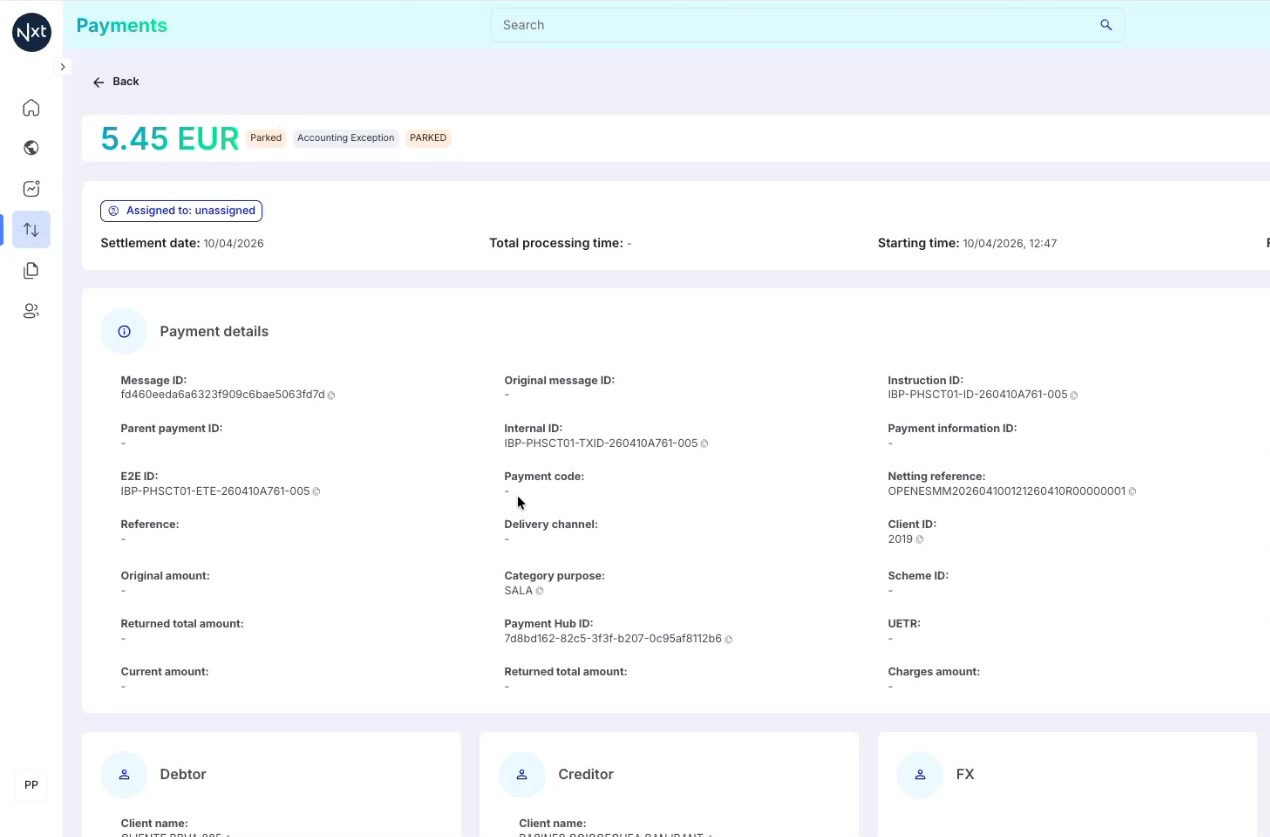
The Payment details section contains all the technical and business information about the payment, organized in a grid layout:
Message ID, Original message ID, Instruction ID
Parent payment ID, Internal ID, Payment information ID
E2E ID, Payment code, Netting reference
Reference, Delivery channel, Client ID
Payment Hub ID (the main identifier, shown in a grey chip)
Most fields have a copy icon next to them — click it to copy the value to your clipboard for use elsewhere.
Tip: The Payment Hub ID is the primary identifier used across the system. It is displayed in a grey chip for easy identification.
Step 6: Debtor and Creditor Information
Further down the page, you will find separate sections for:
Debtor — the party sending the payment (client name, bank account, etc.)
Creditor — the party receiving the payment (client name, bank account, etc.)
FX — foreign exchange information (if applicable)
Each section displays the relevant details for that party, including names, bank accounts, and identification numbers.
Step 7: Audit Events
The Audit section shows the chronological events that have occurred during the payment’s lifecycle. Each event includes a timestamp and a description of what happened.
The audit trail is essential for understanding the full history of a payment and troubleshooting any issues that may have occurred during processing.
Step 8: Related Payments and User Activity
Additional sections include:
Related payments — shows linked payments, for example, a return payment will display the original payment it was created from
User Activity — shows actions performed by users on this payment, such as assignment/unassignment events and any manual actions taken
.jpeg)
Step 9: Payment Action Buttons
When a payment has available actions, action buttons appear at the top-right of the Payment Details view. The available actions depend on the payment’s status. For example, a parked payment with accounting exceptions may offer:
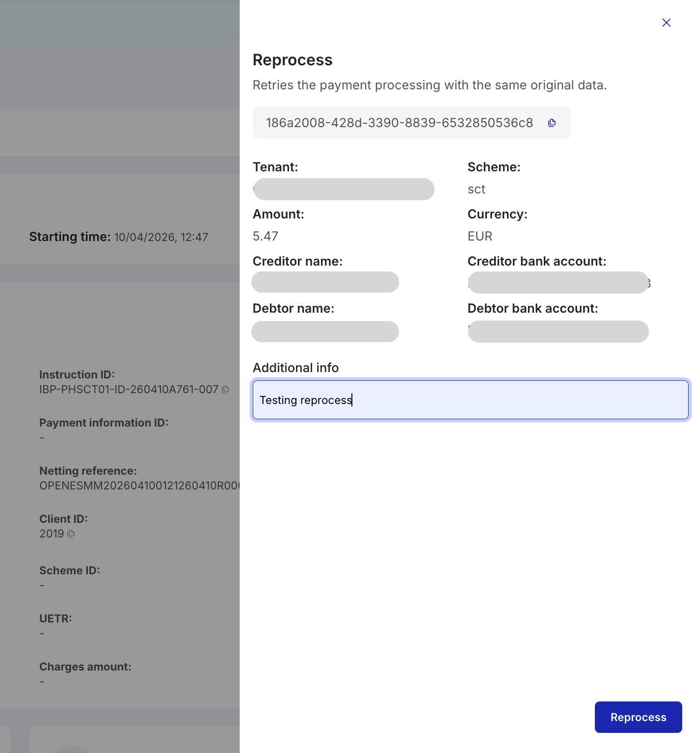
Reprocess — retry processing the payment as-is
Reprocess with changes — modify payment data before retrying
Return — return the payment to the sender
Tip: Action buttons are only displayed when there are valid actions available for the payment’s current status.
(1).png)
Step 10: Reprocess with Changes
Clicking Reprocess with changes opens a sidebar panel on the right. This panel displays the payment’s current data and provides editable fields where you can modify values before reprocessing.
Available fields may include creditor bank account, creditor name, debtor information, BIC codes, and other relevant payment attributes. After making your changes, click the Reprocess with changes button at the bottom to submit.
.png)
Step 11: Confirming a Reprocess Action
When you execute any action (Reprocess, Reprocess with changes, or Return), the system displays a confirmation dialog. You may be asked to provide a reason or comment for the action.
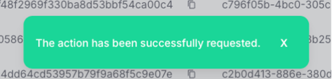
After confirming, the system processes the request and displays a success message: "The action has been successfully requested."
Note: All payment actions are recorded in the audit trail and user activity sections for compliance and traceability.
Quick Reference
Step | Action |
|---|---|
1 | Click a payment in the list to open the Payment Details view |
2 | Review amount, status chips, assignment, and timing information |
3 | Hover over status chips for tooltip details on codes |
4 | Browse Payment details fields (IDs, codes, references) — use the copy icon |
5 | Review Debtor, Creditor, and FX sections for party information |
6 | Check Audit events for the payment’s processing history |
7 | View Related Payments and User Activity for linked transactions |
8 | Use action buttons (Reprocess, Return) when available for parked payments |
Dashboards
Dashboards in Quantum provide a quick, visual way to monitor your payment activity and key operational indicators. They are designed to help you detect issues early, follow execution, and make informed decisions without having to search payment-by-payment.
Quantum includes standard dashboards that are available to most users (ie viewers, operators, managers):
Operational Dashboard — Focused on day-to-day execution and monitoring of payment processing across your tenants.
Business Dashboard — Focused on business-level monitoring and reporting of payment volumes and trends.
New capability: Custom Dashboards
Quantum now also supports Custom Dashboards, allowing users with the appropriate permissions (Tenant configuration role) to create their own dashboards tailored to their specific monitoring needs. The following guides walk you through creating, configuring, and managing custom dashboards.
To create and publish dashboards, you need the Tenant Configuration role.
Note: Only users with the Tenant Configuration role can create, edit, and publish dashboards.
Create a Dashboard
How to navigate the dashboard homepage, create a new dashboard, and understand the empty canvas.
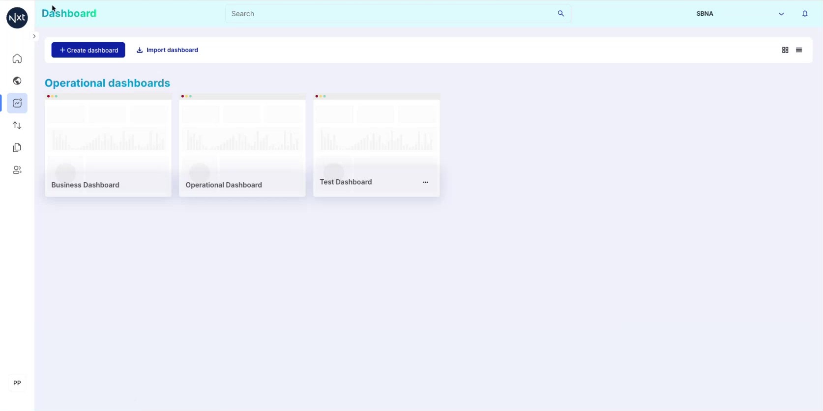
Step 1: Dashboard Homepage
This is the Dashboard homepage, accessible from the left sidebar. It displays all your dashboards as cards.
Dashboards without a three-dots menu (⋯) are system defaults or shared to you — you cannot modify them.
Dashboards with a three-dots menu are ones you have created.
Tip: You can switch between grid and list view using the icons in the top-right corner.
Step 2: Create or Import a Dashboard
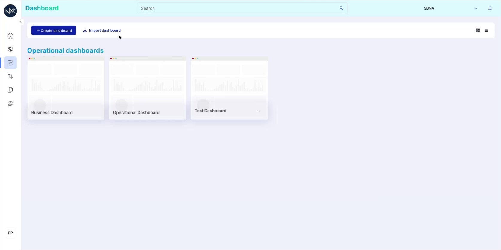
At the top, you have two options:
Create dashboard — Start from scratch
Import dashboard — Import an exported configuration
Click Create dashboard to begin.
Step 3: Name Your Dashboard
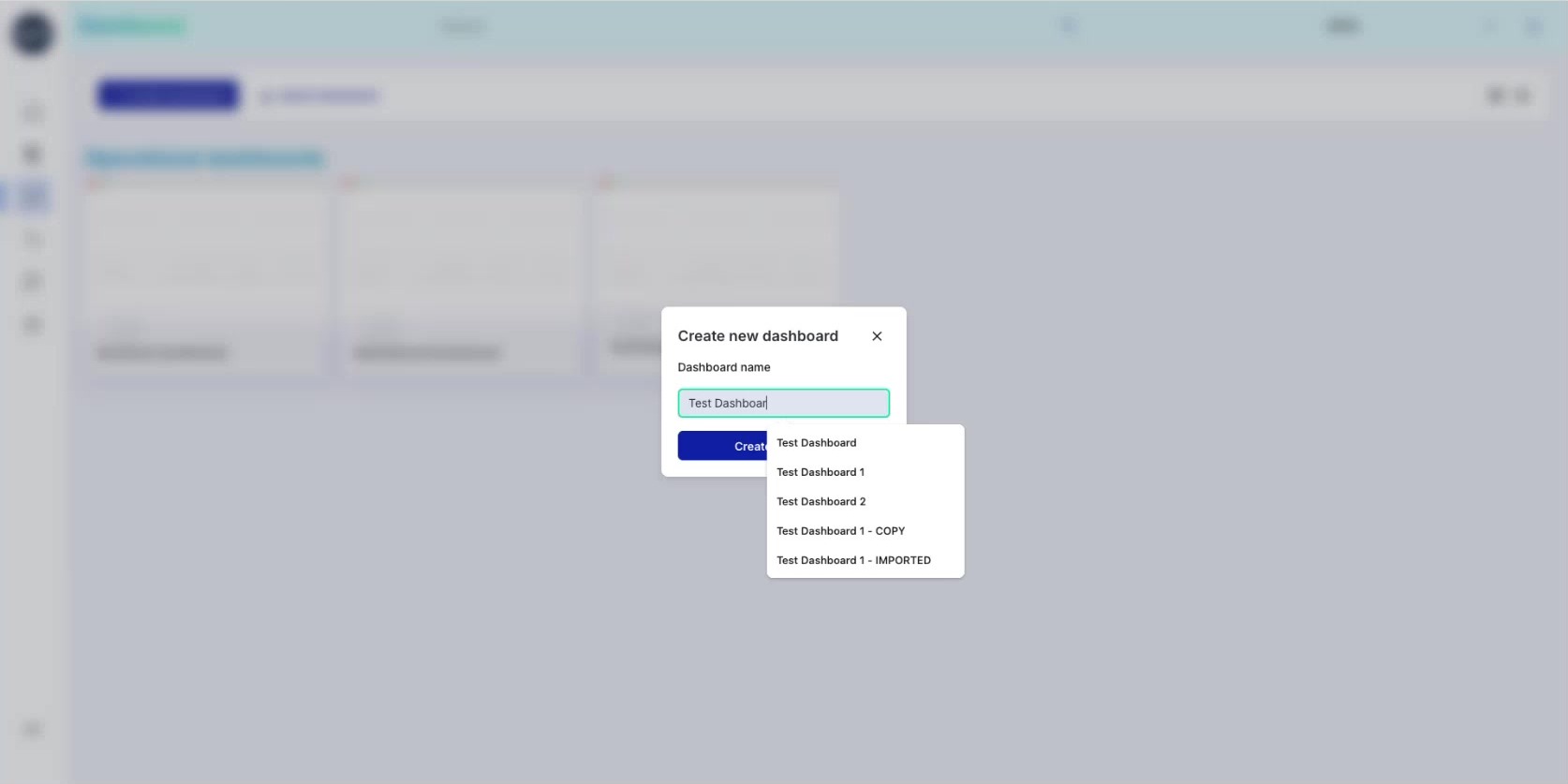
A dialog appears. Type a descriptive name and click Create Dashboard.
The system provides autocomplete suggestions based on existing dashboard names.
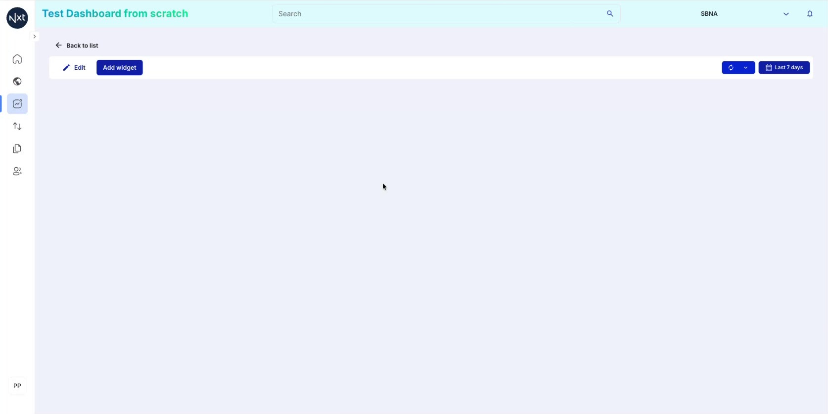
Step 4: The Empty Canvas
You are taken to an empty canvas. The toolbar provides:
Edit — Enter edit mode
Add widget — Open the widget sidebar
Refresh button — Refresh data
Date picker (Last 7 days) — Change the time period
Quick Reference
Step | Action |
|---|---|
1 | Navigate to Dashboard homepage from the sidebar |
2 | Click Create dashboard or Import dashboard |
3 | Enter a name for the new dashboard |
4 | The empty canvas is ready for adding widgets |
Adding Widgets
Add and configure all available widget types — Text, Count, Table, Vertical Bar Chart, and Horizontal Bar Chart — including filters, percentages, duplication, and breakdowns.
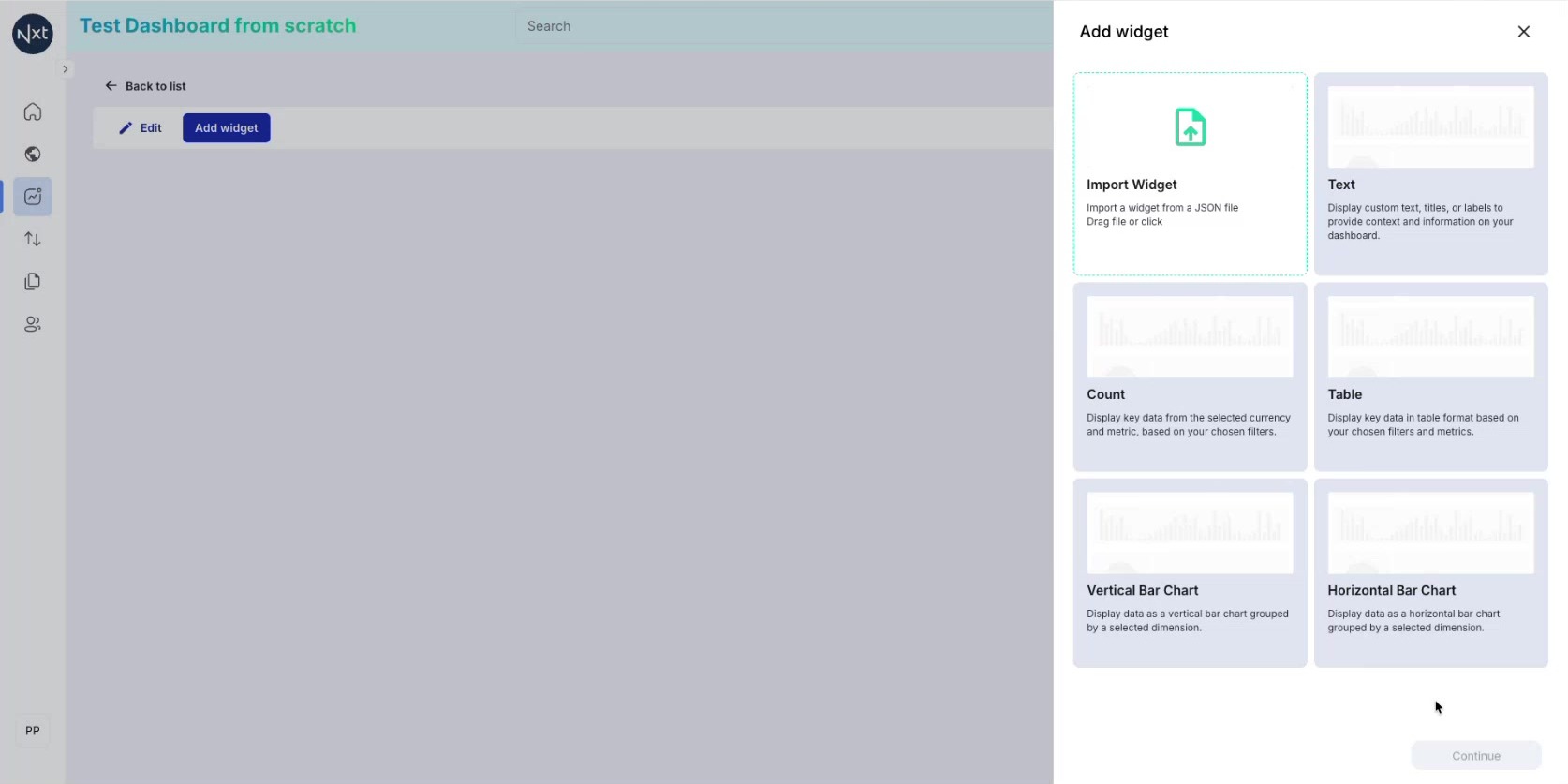
Step 1: Browse Available Widget Types
Click Add widget to open the sidebar. Available types:
Import Widget — Import from JSON
Text — Custom text, titles, labels
Count — Single metric (count or amount)
Table — Data with columns and breakdowns
Vertical Bar Chart / Horizontal Bar Chart
Tip: More types like Pie Chart are coming soon. Double-click to quickly add a widget.
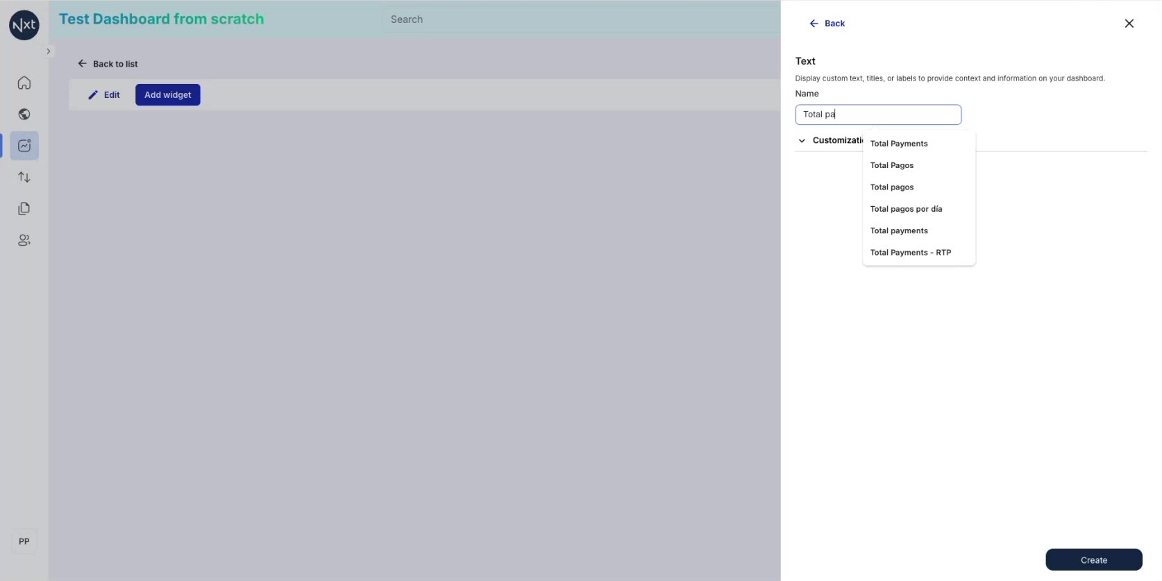
Step 2: Create a Text Widget
Double-click the Text widget. Enter a name for your label (e.g., "Total Payments"). The Name field shows autocomplete suggestions.
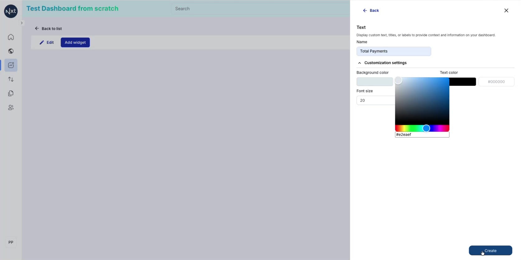
Step 3: Customize Text Widget Colors
Under Customization settings:
Background color — Color picker or hex code
Text color — Set text color
Font size — Adjust size
Click Create when satisfied.
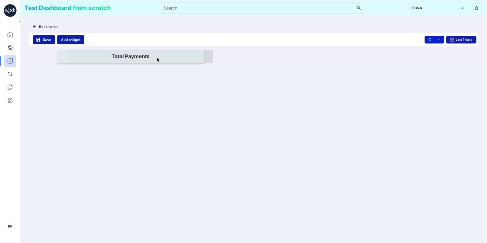
Step 4: Text Widget on the Canvas
The text widget displays on the canvas with your chosen colors. Resize by dragging edges, move by clicking and dragging.
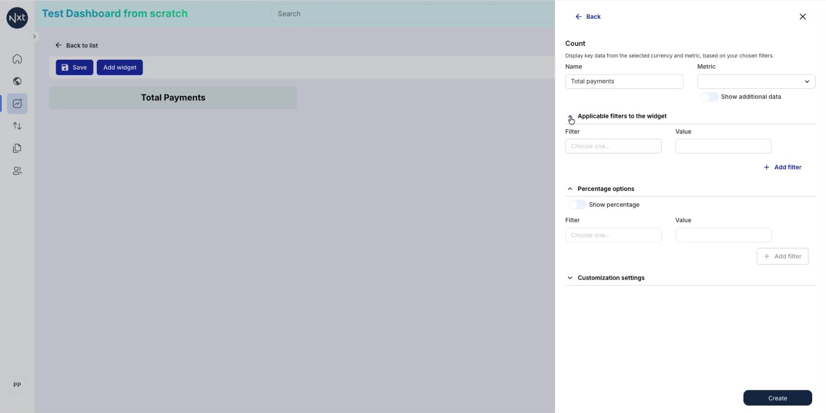
Step 5: Add a Count Widget
Add a Count widget — a box displaying a single metric (count or amount). Configure it as follows, for example:
Name: "Total payments"
Metric: Count
Filters: None (show all data)
This will display the total count for the selected time period and tenant.
Note: The "Percentage options" and "Customization settings" can be left at defaults.
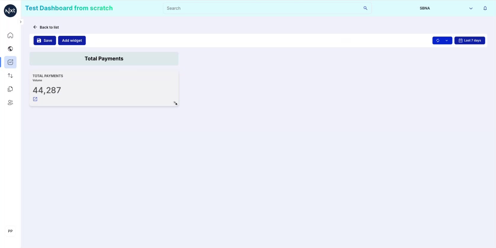
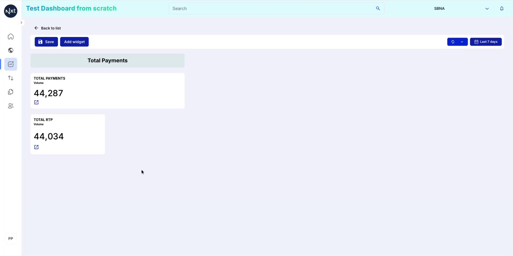
Step 6: Count Widget Created
The count widget appears on the canvas showing the total count (e.g., 44,287) for the selected time period. Each count widget also includes a link icon that navigates to the detailed list for that data.
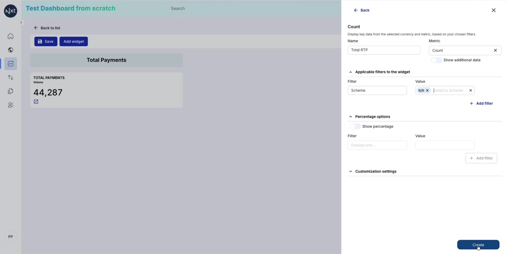
Step 7: Add a Filtered Count Widget
Add another count widget, this time with a filter to narrow down the data. For example, to show only RTP payments:
Name: "Total RTP"
Metric: Count
Filter: Scheme = TCH
Click Create to add the filtered widget.
Tip: Use "+ Add filter" to add more conditions.
Step 8: Filtered Count Widget Created
The filtered count widget now displays the result. In this example, it shows 44,034 RTP payments out of the total 44,287, confirming that the vast majority of transactions go through the RTP scheme.
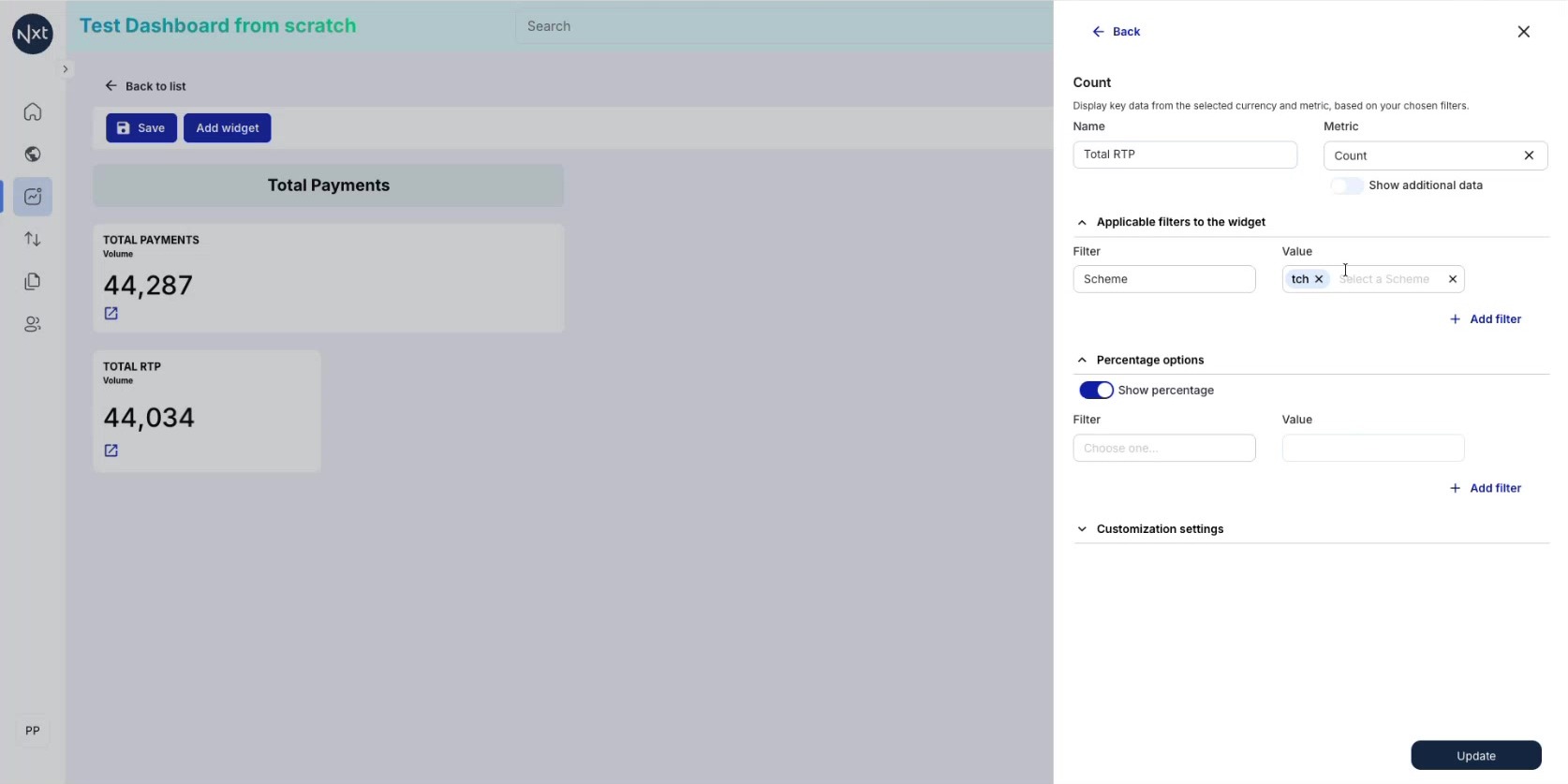
Step 9: Edit a Widget to Show Percentage
Click the edit icon on a count widget to open its configuration. Toggle on Show percentage under "Percentage options". The system calculates what percentage the filtered data represents of the total. Click Update.
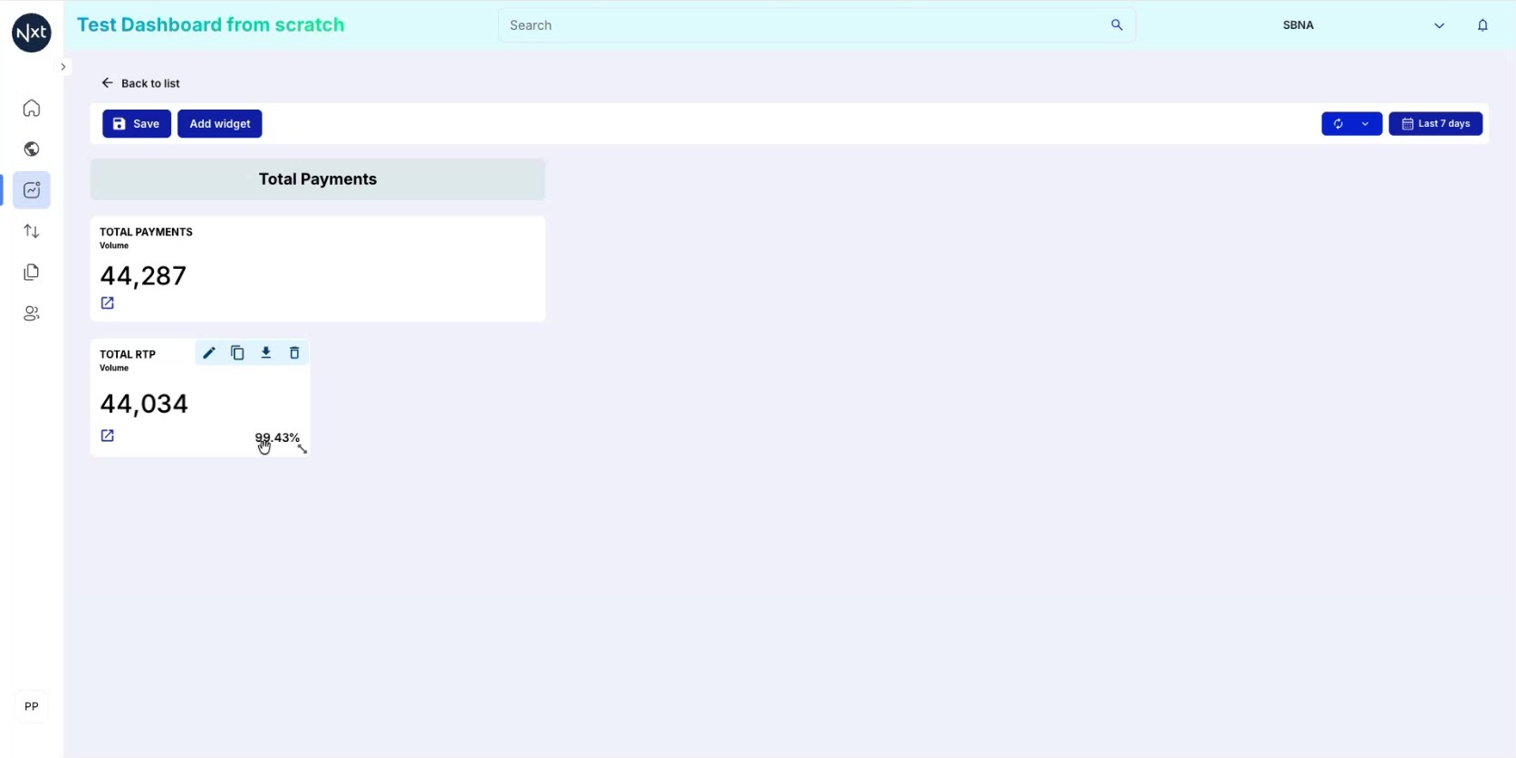
Step 10: Percentage Result Display
The widget now shows both the count and the percentage. For example, RTP represents 99.43% of total payments. This is a powerful way to quickly understand the breakdown of your data.
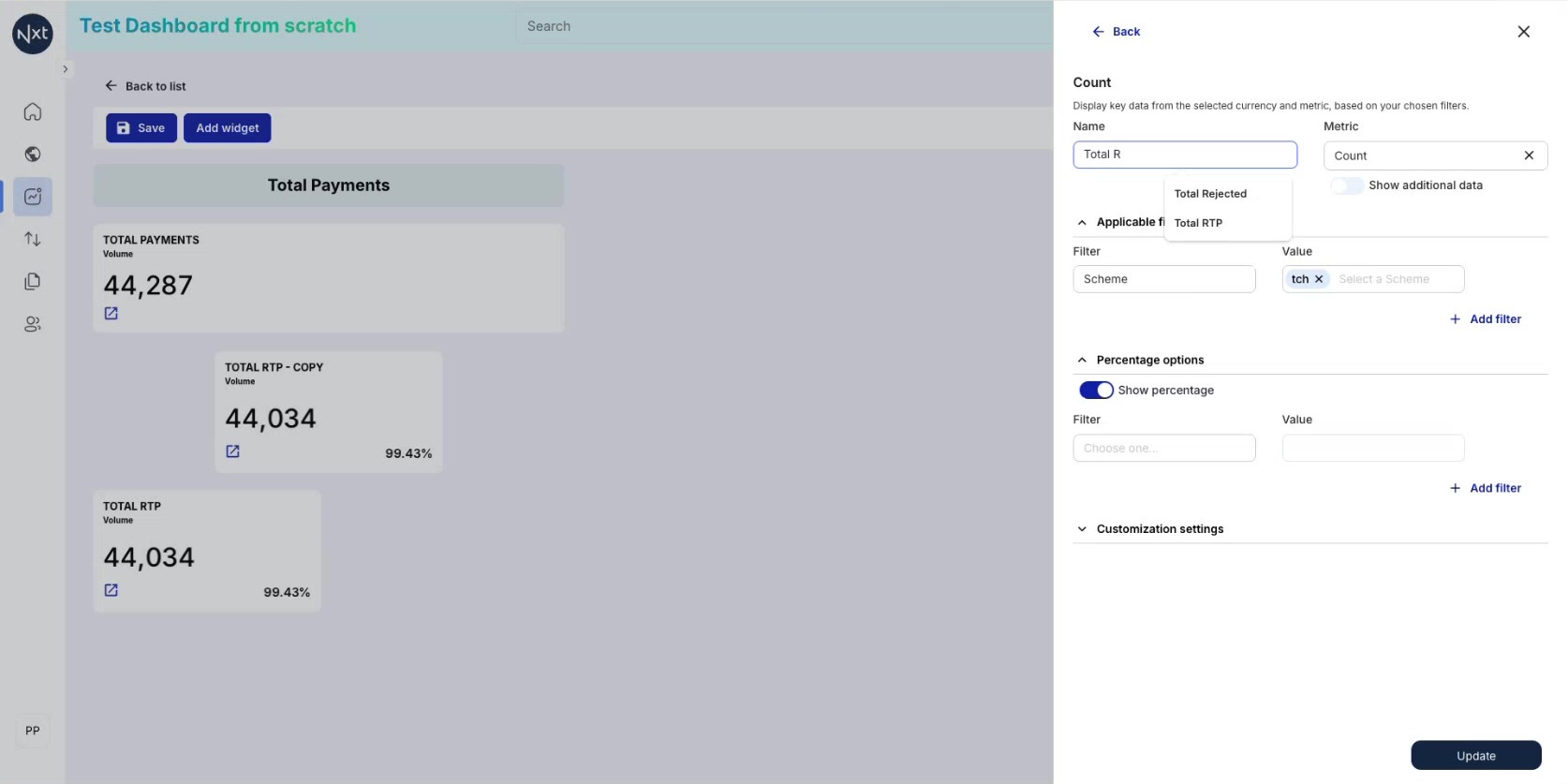
Step 11: Duplicate a Widget
Save time by duplicating a widget. Click the duplicate icon on an existing widget, then modify the copy — change the name, filter values, and other settings as needed.
Tip: Duplicating is ideal when you need similar widgets with different filter values.
Step 12: Dashboard with Multiple Count Widgets
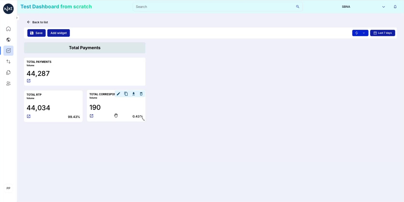
Your dashboard now shows multiple count widgets with different filters. For example:
Total Payments: 44,287
Total RTP: 44,034 (99.43%)
Total Correspondent: 190 (0.43%)
The percentages add up and give you a clear picture of your data distribution.
Step 13: Add a Table Widget
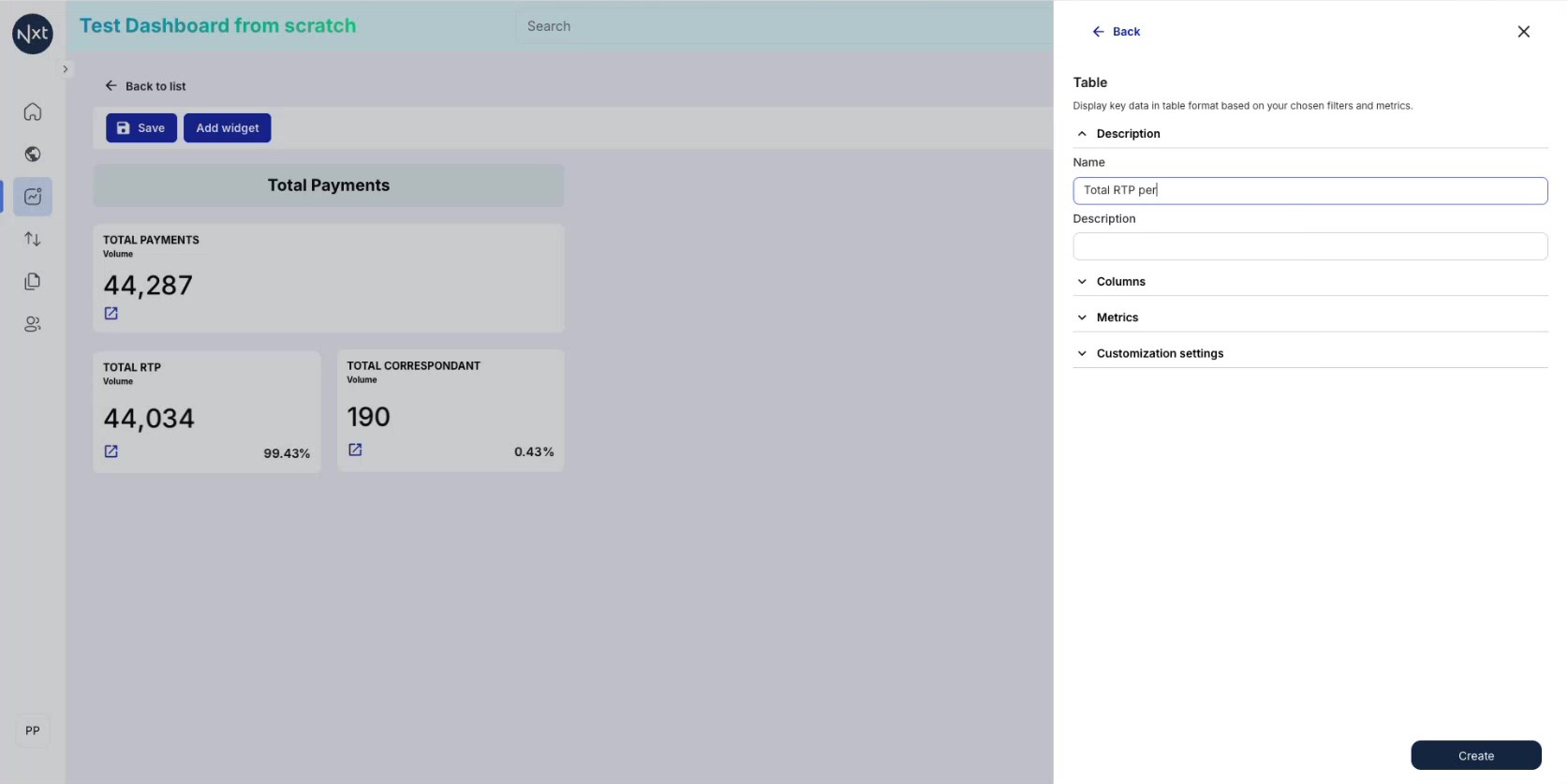
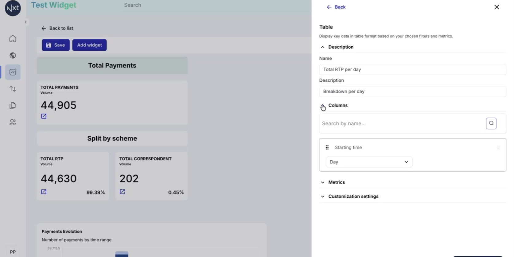
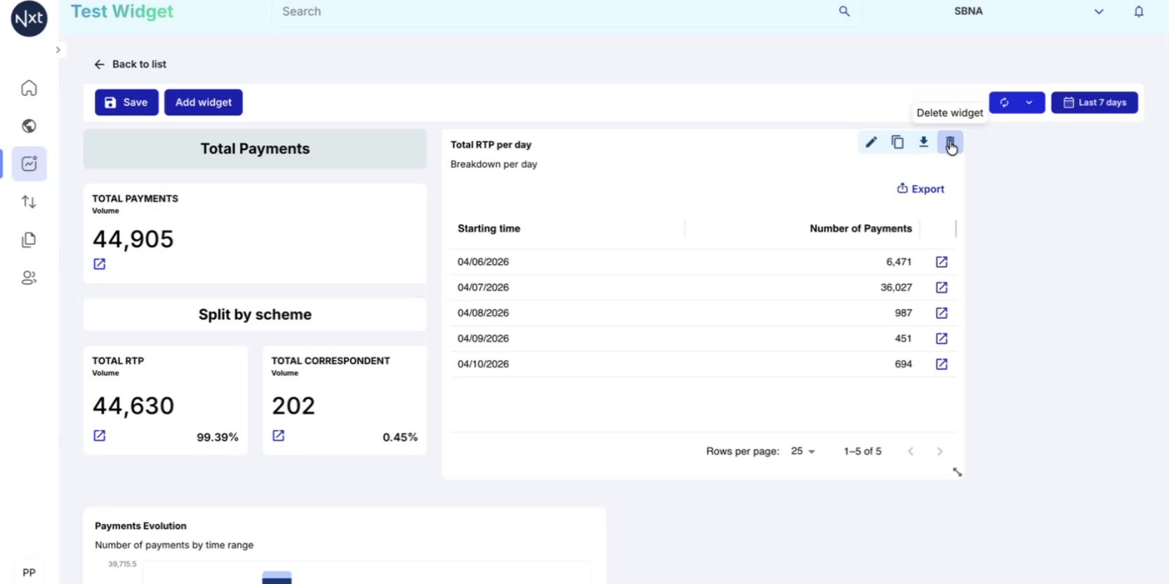
Add a Table widget. Configure it with a name and description. For example:
Name: "Total RTP per day"
Description: "Breakdown per day"
The table widget lets you display data with multiple columns, metrics, and breakdowns.
Step 14: Configure Table Columns and Breakdown
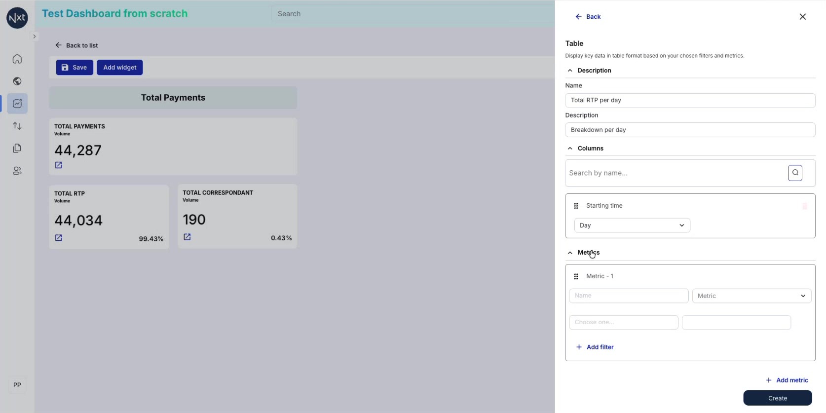
In the table configuration:
Columns: Select the grouping dimension (e.g., Starting time)
Breakdown: Choose a period from the dropdown (Month, Week, Day, Hour)
Metrics: Select the metric and optionally add filters
For example, selecting Starting time with Day breakdown and a Scheme = TCH filter creates a daily breakdown of RTP payments.
Tip: For a one-week window, "Day" is the best breakdown. Use "Week" or "Month" for longer periods.
Step 15: Table Widget on the Dashboard
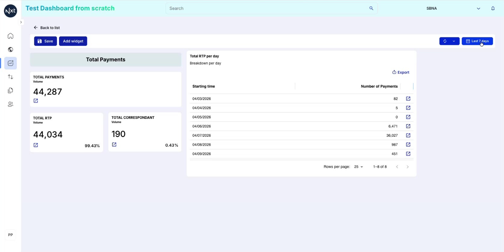
The table widget appears. Resize it by dragging the edges to see all data properly.
Step 16: Add a Vertical Bar Chart Widget
Click Add widget and select Vertical Bar Chart. Vertical bar charts are ideal for representing histograms and time-based distributions — for example, showing the number of items processed per day or per hour.
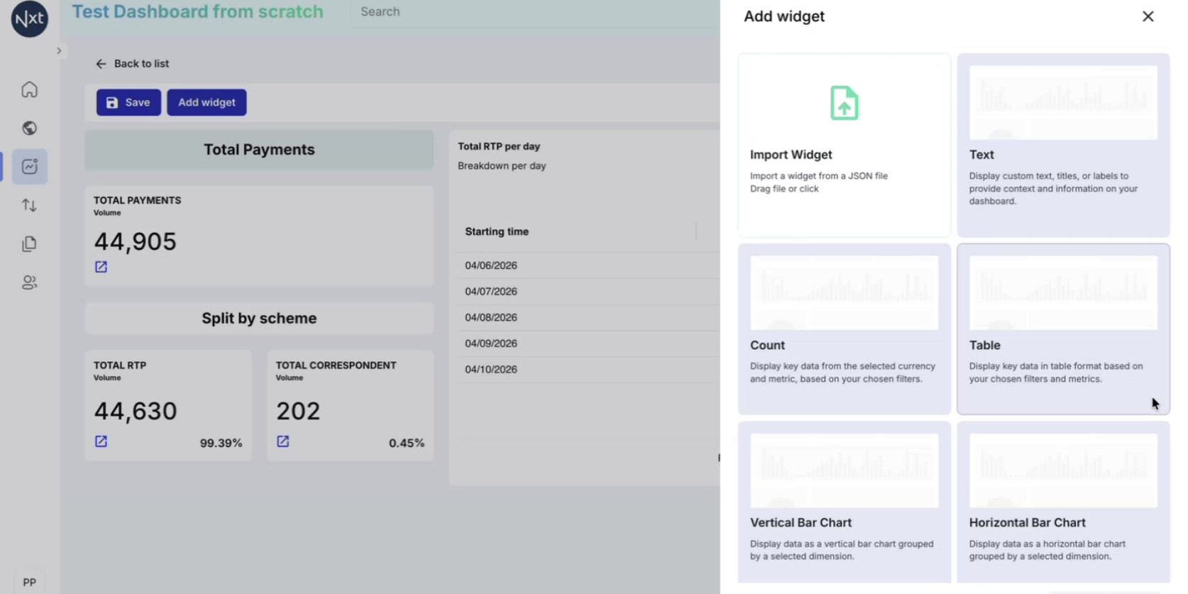
Step 17: Configure the Vertical Bar Chart
In the configuration panel, set up the chart parameters:
Name: Enter a descriptive name for the widget
Description: Optionally add a description
Dimension: Select the attribute that will drive each bar. For example, choosing Starting time creates a time-based histogram where each bar represents a time period
Metric: Choose Count to display the number of items, or Amount for sum of values
Breakdown: Optionally select an attribute to split each bar by category (e.g., by flow, by scheme)
Click Create when your configuration is complete.
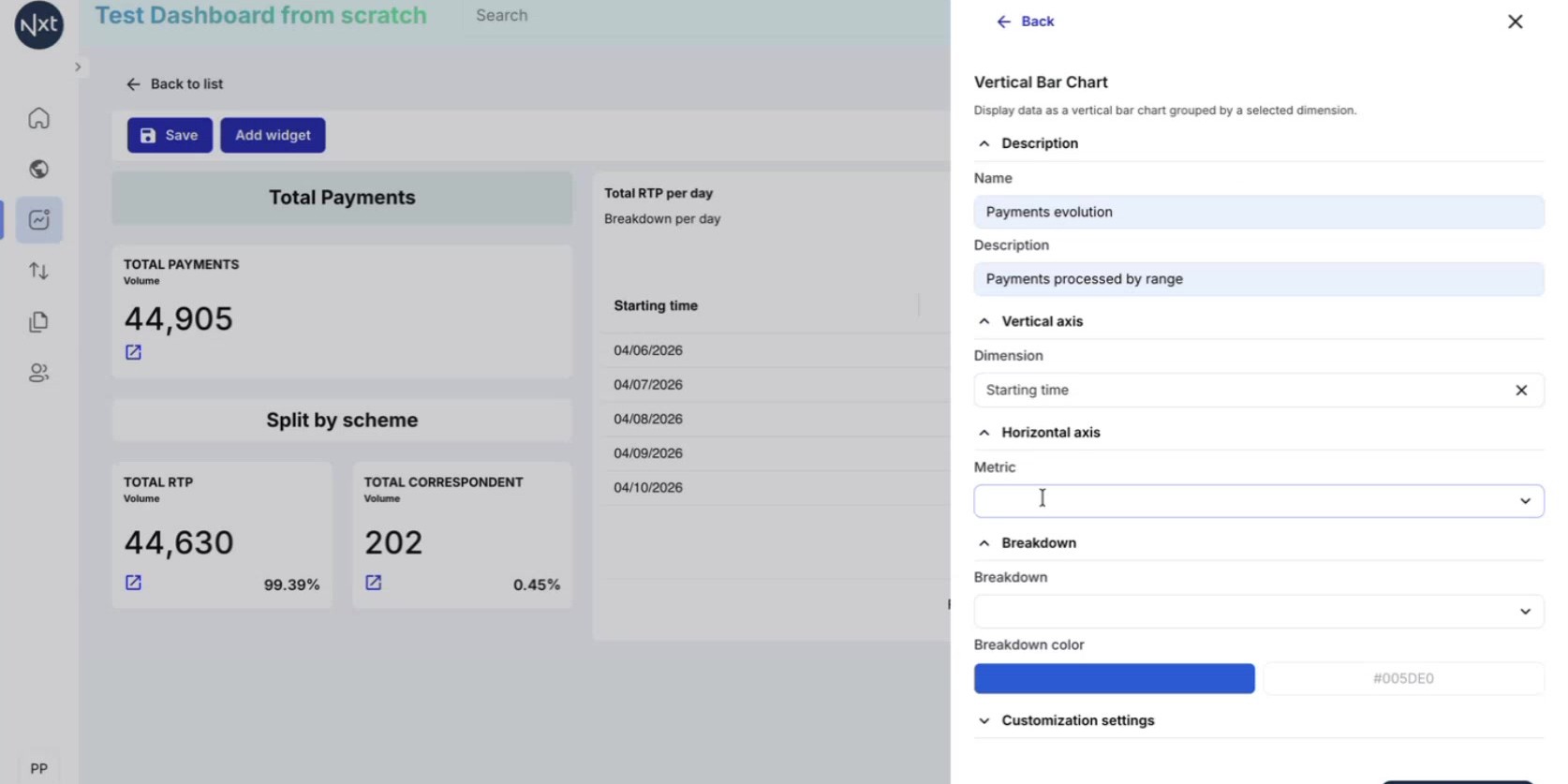
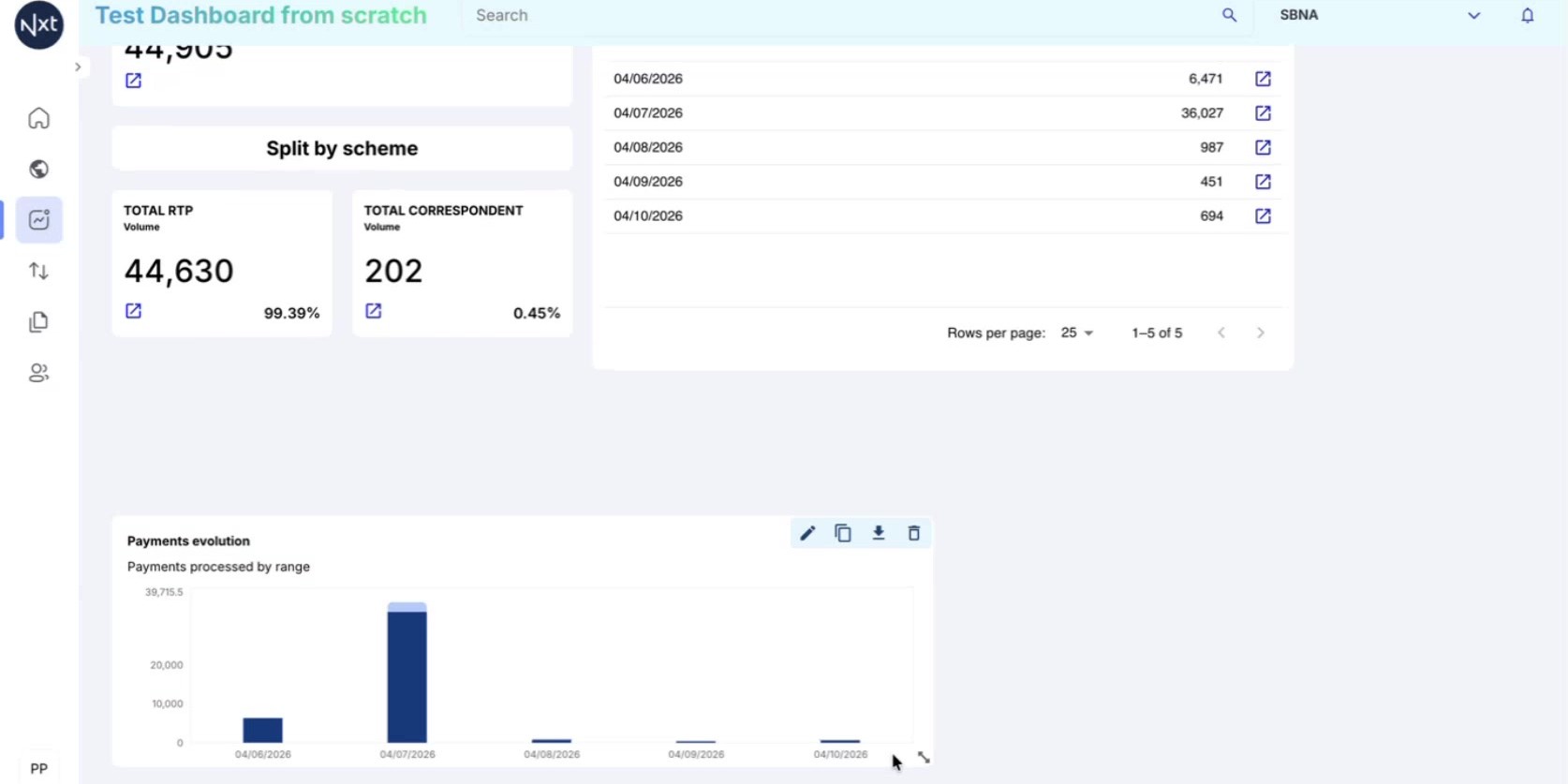
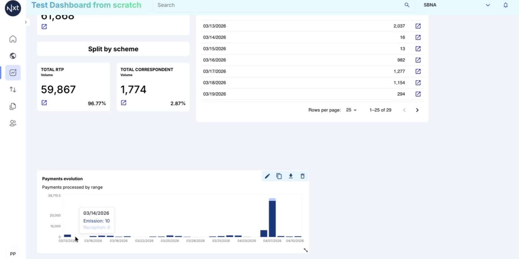
Step 18: Vertical Bar Chart Created
The vertical bar chart now appears on the dashboard canvas. Each bar represents a time period (e.g., one day), and if you selected a breakdown, the bars are color-coded by category.
You can resize the widget by dragging its edges to make the chart larger and easier to read.
Tip: Resize the chart widget to make the bars and labels more readable, especially when displaying many time periods.
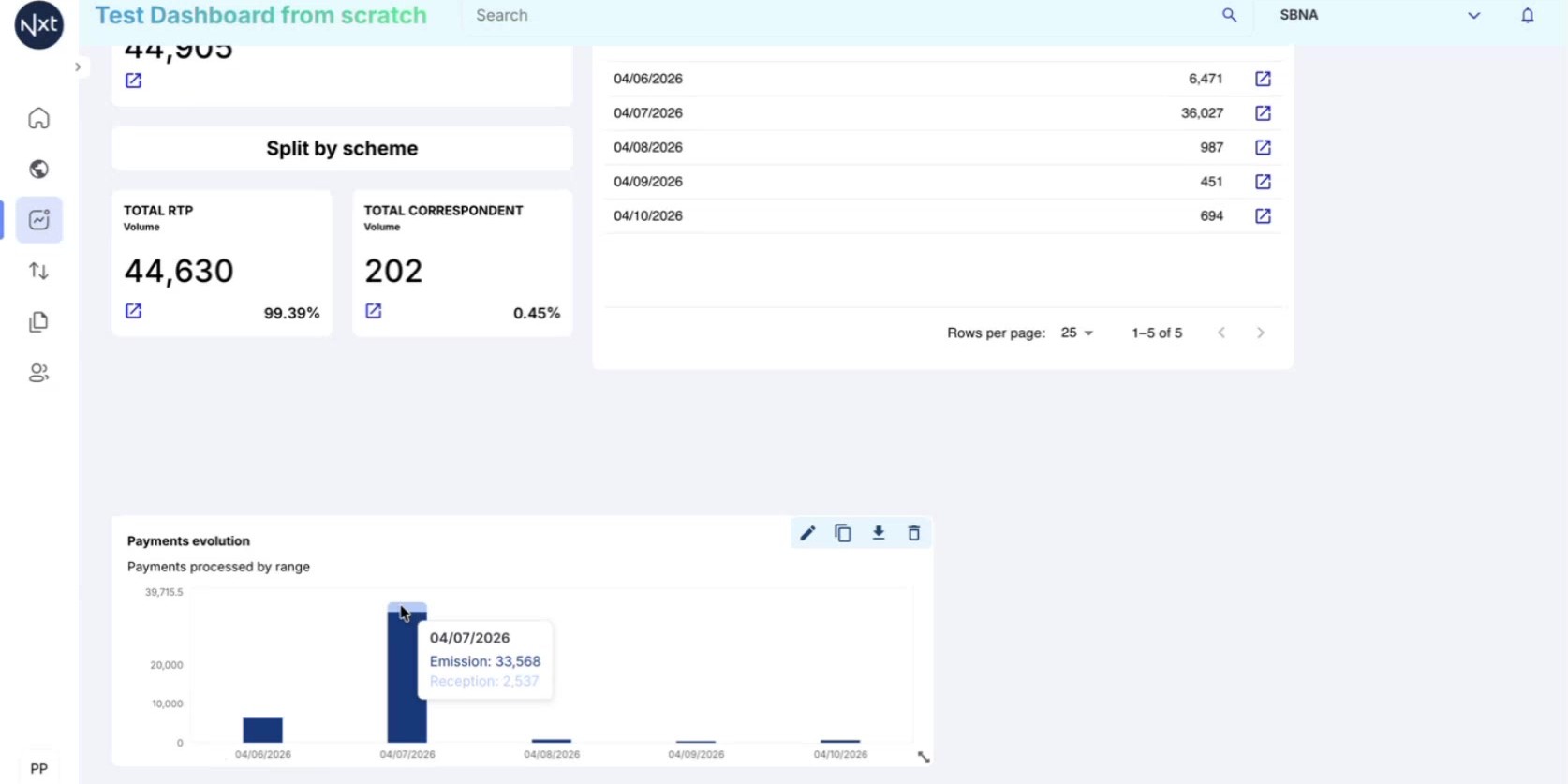
Step 19: Interact with Chart Data
Hover over any bar to see a tooltip with the exact values. When a breakdown is configured, the tooltip shows the count for each category within that time period.
For example, if your breakdown is by flow, hovering over a bar will show the count for each flow type on that specific day.
Step 20: Adjust the Date Range
The chart automatically adapts to the selected date range in the date picker at the top right. Change the range (e.g., from "Last 7 days" to "Last month") and the chart will update to display bars for the new period.
For longer date ranges, you will see more bars representing additional time periods. The chart scales automatically to fit the data.
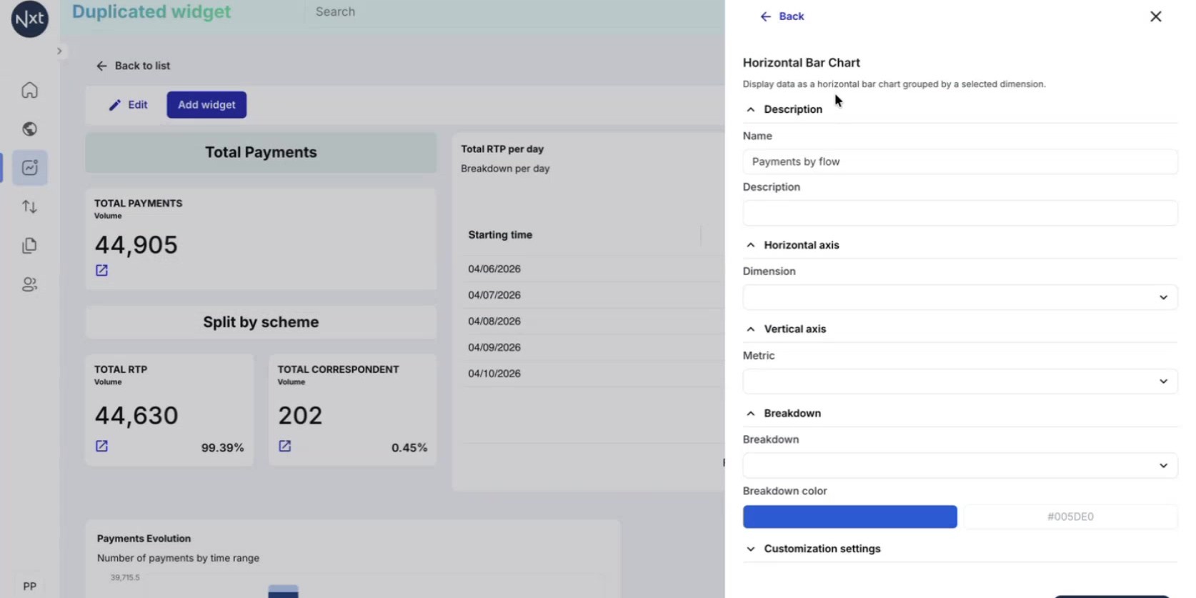
Step 21: Add a Horizontal Bar Chart Widget
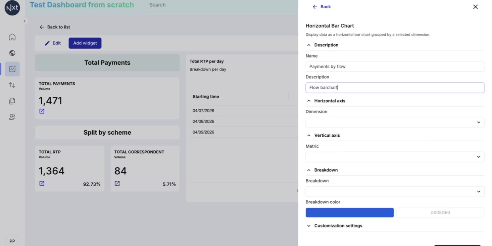
Add a Horizontal Bar Chart widget. Horizontal bar charts are useful for comparing values across categories.
Configure it with:
Dimension: Select the primary attribute to compare (e.g., flow type, status)
Metric: Choose Count or Amount
Breakdown: This is optional — you can leave it empty for a simpler chart
Click Create to add it to the dashboard.
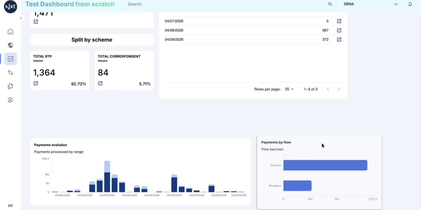
Step 22: Dashboard with All Widget Types
Your dashboard now includes all available widget types: Text, Count, Table, Vertical Bar Chart, and Horizontal Bar Chart. Each serves a different visualization purpose.
Remember to click Save to persist all your changes.
Note: All chart and table widgets respond to the global date picker, so changing the date range updates all widgets simultaneously.
Quick Reference
Step | Action |
|---|---|
1 | Browse available widget types from the Add widget sidebar |
2 | Add a Text widget for a title or header label |
3 | Add a Count widget to display a single metric |
4 | Add a filtered Count widget with percentage display |
5 | Duplicate widgets to create variants with different filters |
6 | Add a Table widget with time-based breakdown |
7 | Add a Vertical Bar Chart for time-based distributions |
8 | Add a Horizontal Bar Chart for category comparisons |
9 | Resize and arrange all widgets on the canvas |
10 | Click Save to persist the dashboard |
Filtering a Dashboard (including Negative Filters)
Apply filters to an entire dashboard at once — including the new negative operators to exclude data from every widget.
Step 1: Open the Dashboard Filters Panel
On any dashboard, click the Filters button in the top-right corner. A filter panel opens above your widgets. Filters set here apply to the whole dashboard — every widget (counts, tables, and charts) recalculates against the same conditions.
Step 2: Add a Filter Condition
Each condition is made of a Filter (the field), an operator and a Value. Choose the field you want to filter on, pick an operator, and set the value. Click + Add to stack more conditions — they combine together to narrow the data.
Step 3: Use Negative Filters (Is not)
Alongside the standard Is operator, you can now choose Is not to exclude matching records. For example, setting Product Is not correspondentbanks returns every payment except those with the correspondent-banks product.
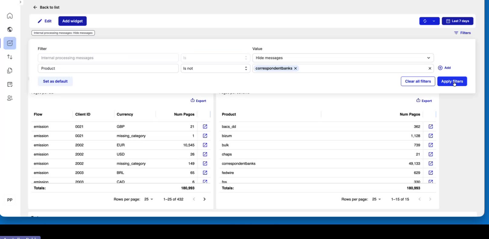
Tip: Negative filters are ideal for “everything except…” analysis — you exclude the one value you don’t want instead of having to list every value you do want.
Step 4: Apply, Clear, or Set as Default
Click Apply filters to update the dashboard. Active filters are shown as chips just below the toolbar.
[Just for the creator or editor of the dashboard]: use Clear all filters to reset everything, or Set as default to save the current filters so the dashboard opens with them next time.
Step 5: See the Effect on Your Data
Every widget recalculates for the filtered set, so totals and breakdowns change immediately. Removing a filter — via its chip or Clear all filters — brings the excluded records back and the totals return to their previous values.
Quick Reference
Step | Action |
|---|---|
1 | Click Filters (top-right) to open the dashboard-wide filter panel |
2 | Add a condition: choose a field, operator, and value; use + Add for more |
3 | Choose Is not to exclude matching records (negative filter) |
4 | Apply filters, Clear all filters, or Set as default |
5 | All widgets update; remove the filter to restore the excluded data |
Export and Import Widgets
Export widgets as JSON files to reuse them across dashboards, import widgets from JSON, and delete widgets you no longer need.
Step 1: Why Export and Import Widgets
Exporting and importing widgets allows you to:
Reuse a widget in another dashboard without recreating it from scratch
Share a widget configuration with a colleague who is building their own dashboard
Back up a widget configuration before making changes
The export produces a JSON file containing the full widget configuration, which can then be imported into any dashboard.
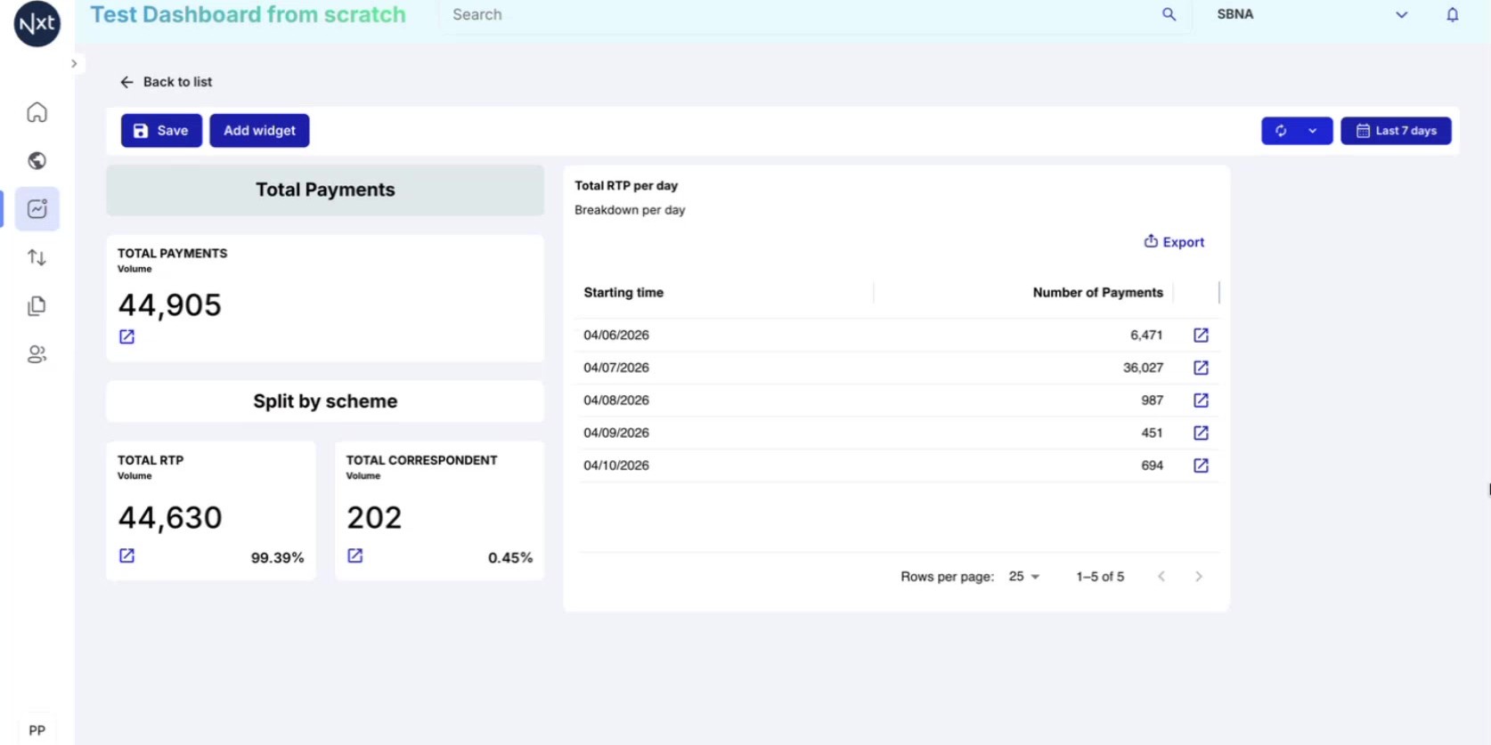
Step 2: Export a Widget
To export a widget, enter edit mode on your dashboard. Hover over the widget you want to export and look for the action icons in the top-right corner of the widget.
Click the Export icon (download arrow). The system immediately downloads a JSON file to your computer containing the complete widget configuration.
Tip: The exported JSON file name includes the widget name and a timestamp, making it easy to identify later.
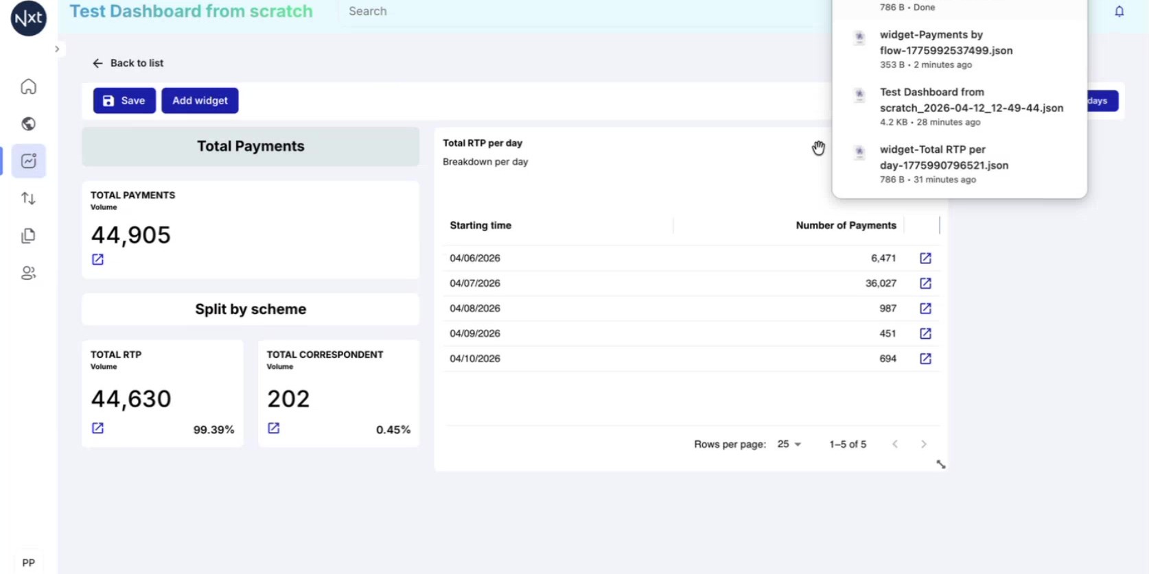
Step 3: Navigate to the Target Dashboard
Save your current dashboard and navigate to the dashboard where you want to import the widget. Click Back to list to return to the dashboard list, then open the target dashboard.
Enter edit mode on the target dashboard to enable the Add widget option.
Step 4: Import a Widget
Click Add widget and select Import Widget at the top of the widget panel. A file browser dialog will appear.
Navigate to the JSON file you previously exported (typically in your Downloads folder), select it, and click Open. The system reads the JSON file and pre-fills all the widget configuration fields.
Step 5: Review and Create the Imported Widget
After selecting the file, the widget configuration panel displays all the settings from the exported widget. Review the configuration — the name, description, columns, metrics, and filters are all pre-populated from the JSON file.
Click Create to add the widget to your dashboard. It will appear with exactly the same configuration as the original.
Step 6: Delete a Widget
To remove a widget from a dashboard, enter edit mode and hover over the widget. Click the trash icon (Delete widget) in the top-right corner of the widget.
The widget will be removed immediately from the dashboard.
Note: Deleting a widget is a non-reversible action. Make sure to export the widget first if you might need it later.
Quick Reference
Step | Action |
|---|---|
1 | Enter edit mode and click the Export icon on a widget |
2 | A JSON file is downloaded to your computer |
3 | Open the target dashboard and enter edit mode |
4 | Click Add widget → Import Widget and select the JSON file |
5 | Review the pre-filled configuration and click Create |
6 | To delete a widget, use the trash icon in edit mode |
Manage Dashboards
Duplicate, delete, export, and import entire dashboards to organize and share your work across environments.
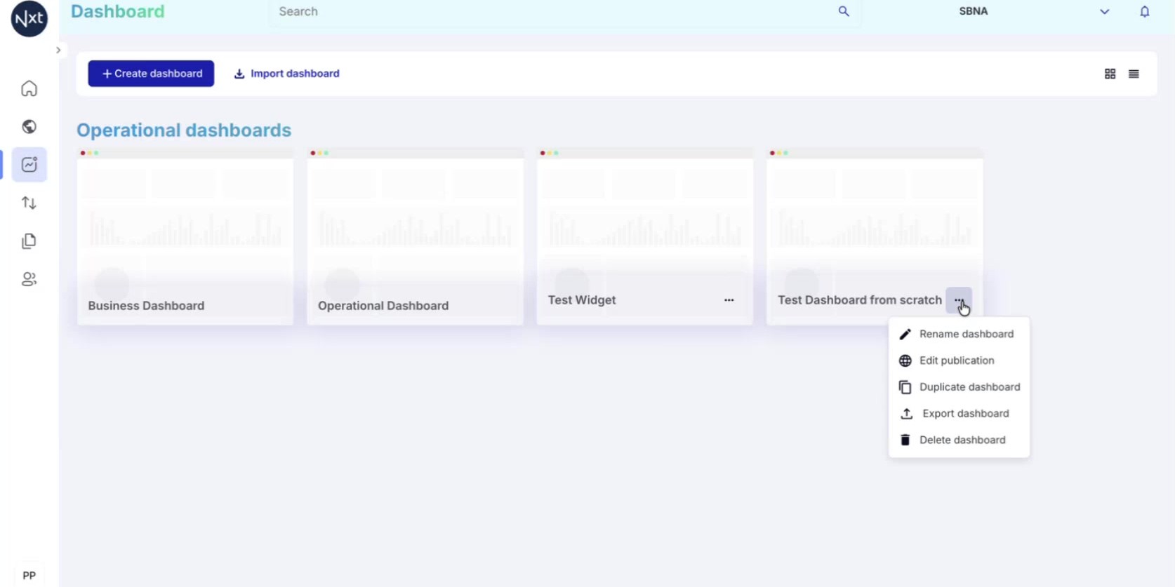
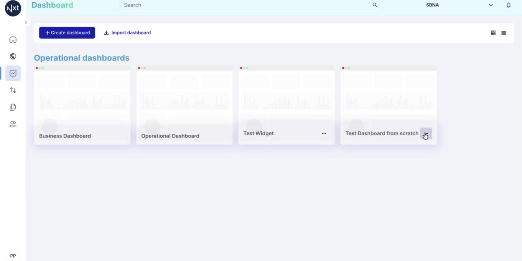
Step 1: Access Dashboard Options
From the Dashboard list, click the three-dots menu (⋯) on any dashboard you have created. A context menu appears with the following options:
Rename dashboard — Change the dashboard name
Edit publication — Manage who can see the dashboard
Duplicate dashboard — Create an identical copy
Export dashboard — Download the dashboard as a JSON file
Delete dashboard — Permanently remove the dashboard
Tip: Only dashboards you have created show the three-dots menu. System dashboards and shared dashboards do not have this menu.
Step 2: Duplicate a Dashboard
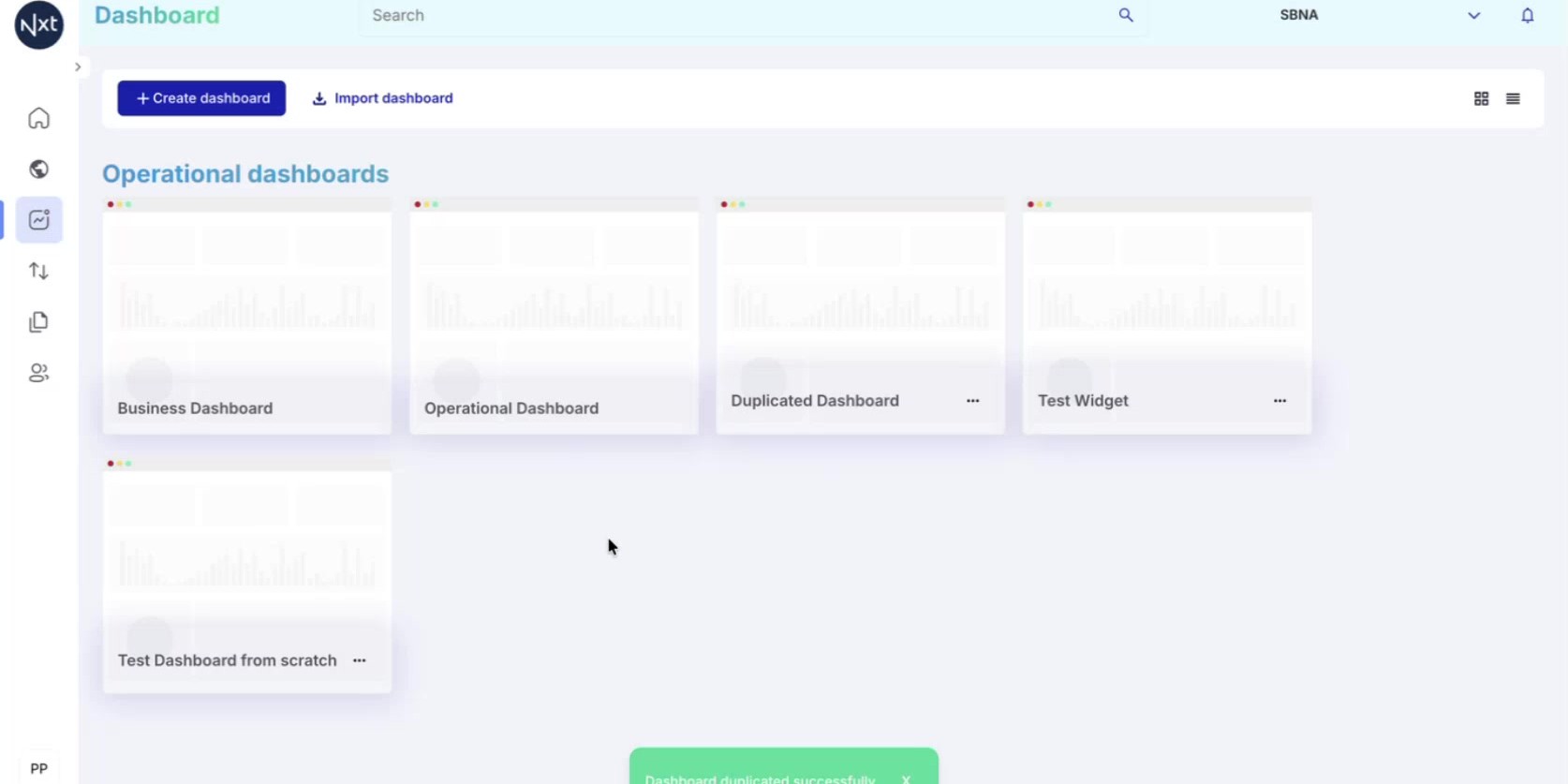
Click Duplicate dashboard from the context menu. The system creates a brand new dashboard that is an exact copy of the original, including all widgets and their configurations.
The duplicated dashboard appears in your dashboard list with the name you provide. Open it to verify that all widgets are identical to the original.
Step 3: Delete a Dashboard
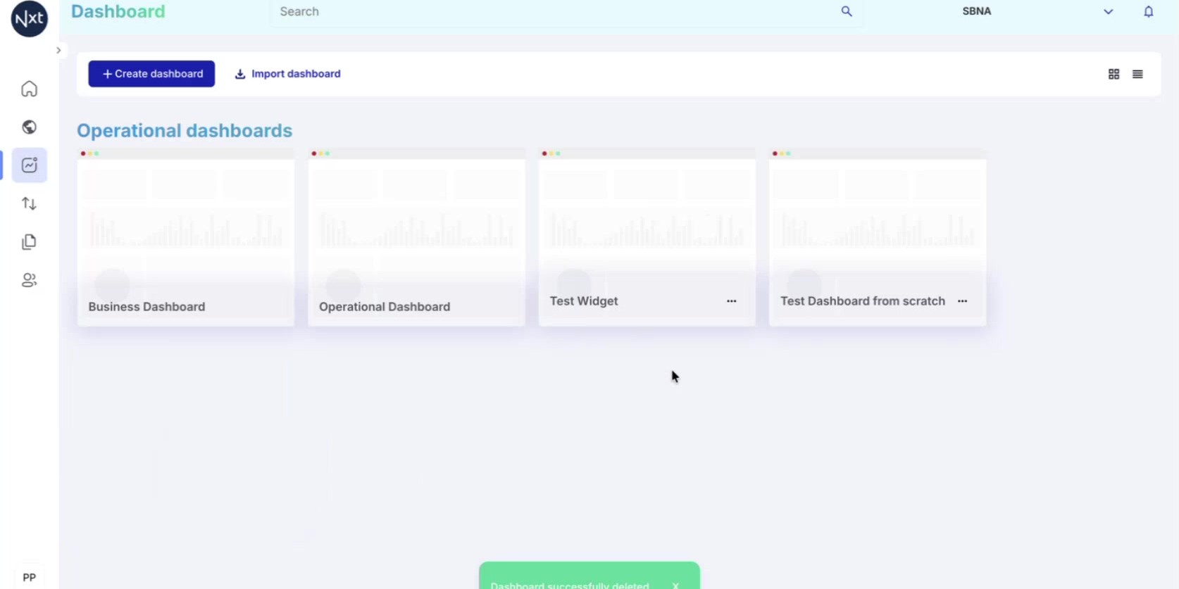
To remove a dashboard, click the three-dots menu (⋯) and select Delete dashboard. A confirmation dialog may appear asking you to confirm the action.
Once confirmed, the dashboard and all its widgets are permanently removed. A success notification appears at the bottom of the screen.
Note: Deleting a dashboard is a non-reversible action. Consider exporting the dashboard first as a backup before deleting.
Step 4: Export a Dashboard
Click the three-dots menu (⋯) on a dashboard and select Export dashboard. The system generates a JSON file containing the complete dashboard configuration — including all widgets, their settings, filters, and layout.
This is useful for:
Sharing a dashboard with a colleague
Promoting a dashboard between environments (e.g., from pre-production to production)
Backing up a dashboard before making changes
Step 5: Import a Dashboard
Click the Import dashboard button at the top of the dashboard list page. A file browser dialog opens where you can select the previously exported JSON file.
Navigate to the file (typically in your Downloads folder), select it, and click Open.
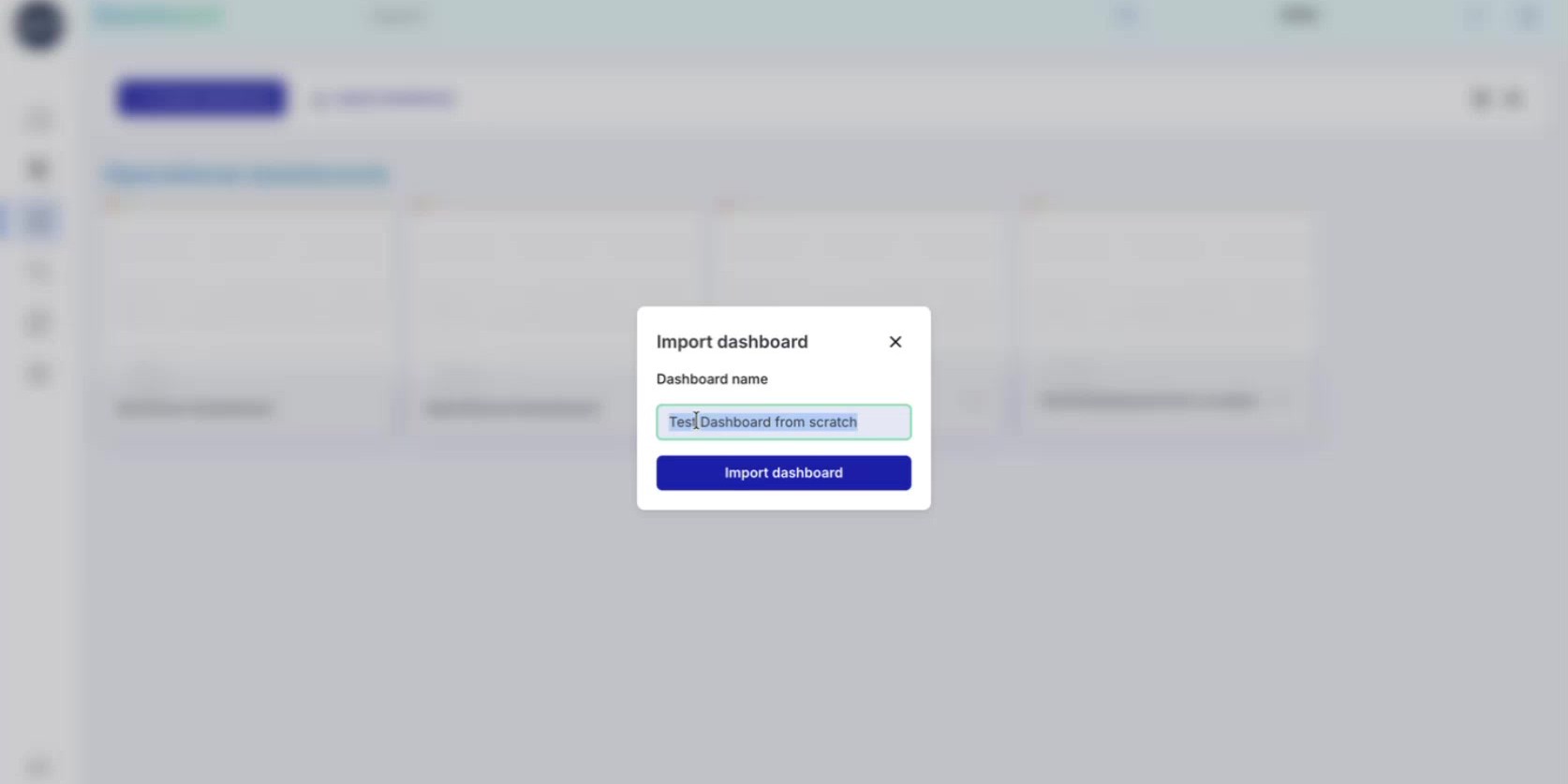
Step 6: Name the Imported Dashboard
After selecting the JSON file, a dialog appears asking you to provide a name for the imported dashboard. The system pre-fills the name from the original dashboard, but you can change it to anything you prefer.
Click Import dashboard to complete the process.
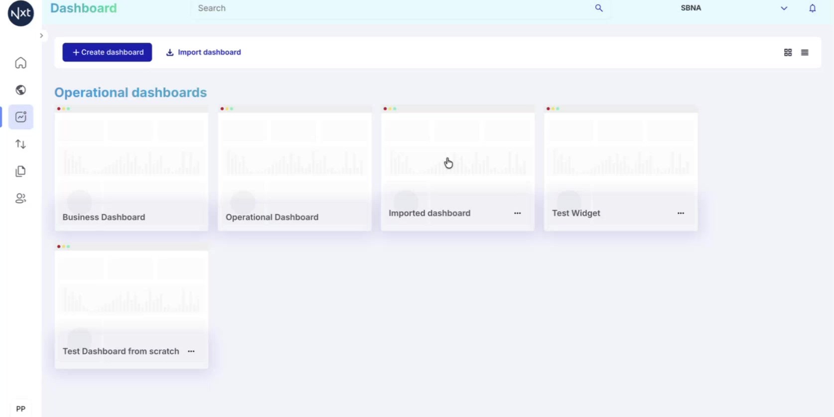
Step 7: Imported Dashboard Available
The imported dashboard now appears in your dashboard list alongside your other dashboards. It contains all the same widgets and configurations as the original export.
This workflow is especially useful for promoting dashboards between environments — for example, you can export a dashboard from a pre-production environment and import it into production without having to recreate everything manually.
Quick Reference
Step | Action |
|---|---|
1 | Click the three-dots menu (⋯) on a dashboard to see options |
2 | Duplicate: creates an exact copy of the dashboard |
3 | Delete: permanently removes the dashboard (non-reversible) |
4 | Export: downloads a JSON file with the full configuration |
5 | Import: click Import dashboard, select JSON, provide a name |
Publishing Dashboards
Control dashboard visibility by publishing to specific roles and tenants, or unpublishing to make them private again.
Step 1: Understanding Dashboard Visibility
By default, dashboards you create are private — only visible to you as the creator. To make a dashboard visible to other users, you need to publish it.
Publishing is controlled by roles and tenants:
Roles define which user types can see the dashboard (e.g., viewers, operators, managers)
Tenants define which organizational units can access it
To create and publish dashboards, you need the Tenant Configuration role.
Note: Only users with the Tenant Configuration role can create, edit, and publish dashboards.
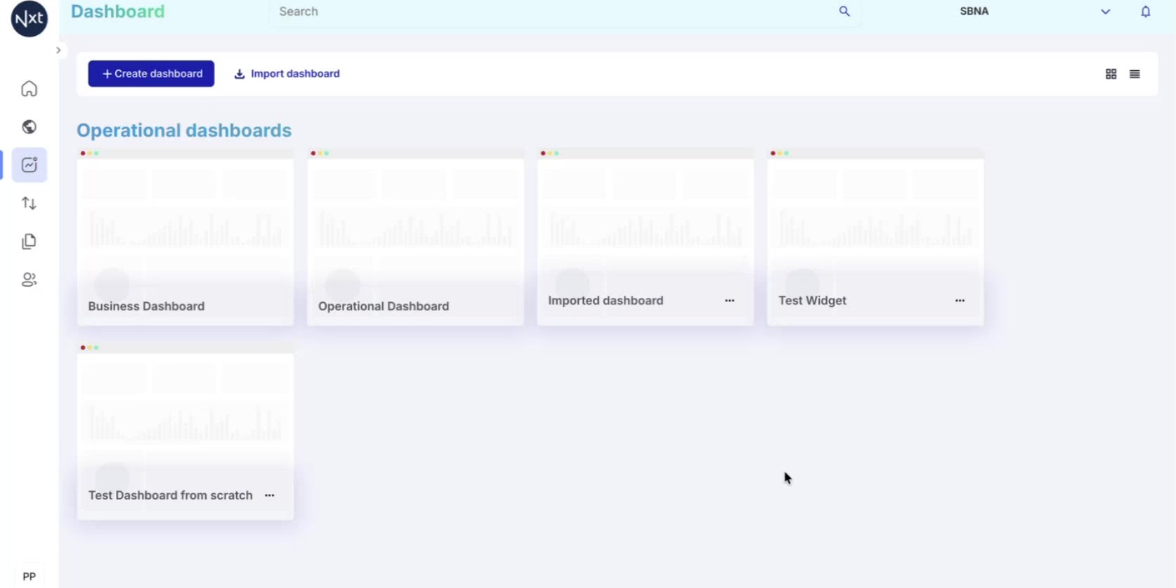
Step 2: Open the Publish Dialog
From the dashboard list, click the three-dots menu (⋯) on the dashboard you want to publish and select Publish dashboard.
Alternatively, you can access this from Edit publication if the dashboard has been previously published.
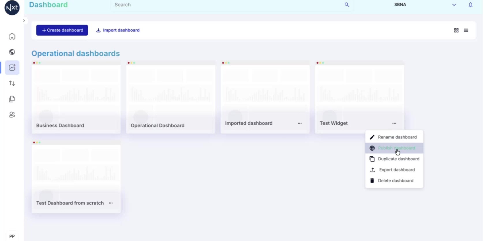
Step 3: Select Roles to Publish To
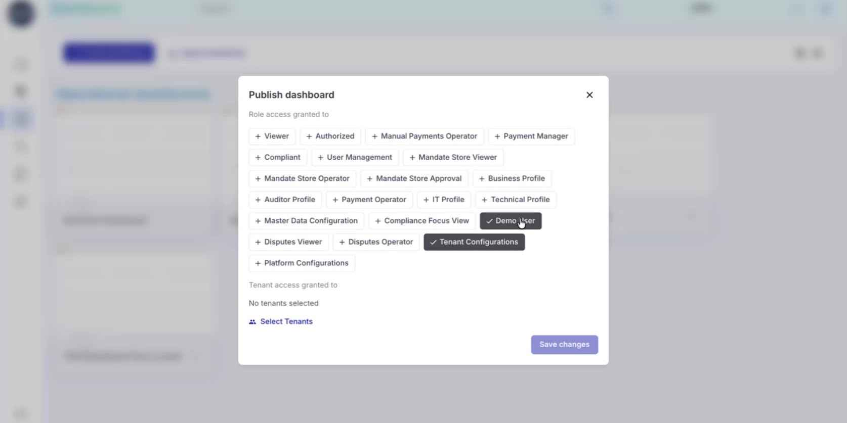
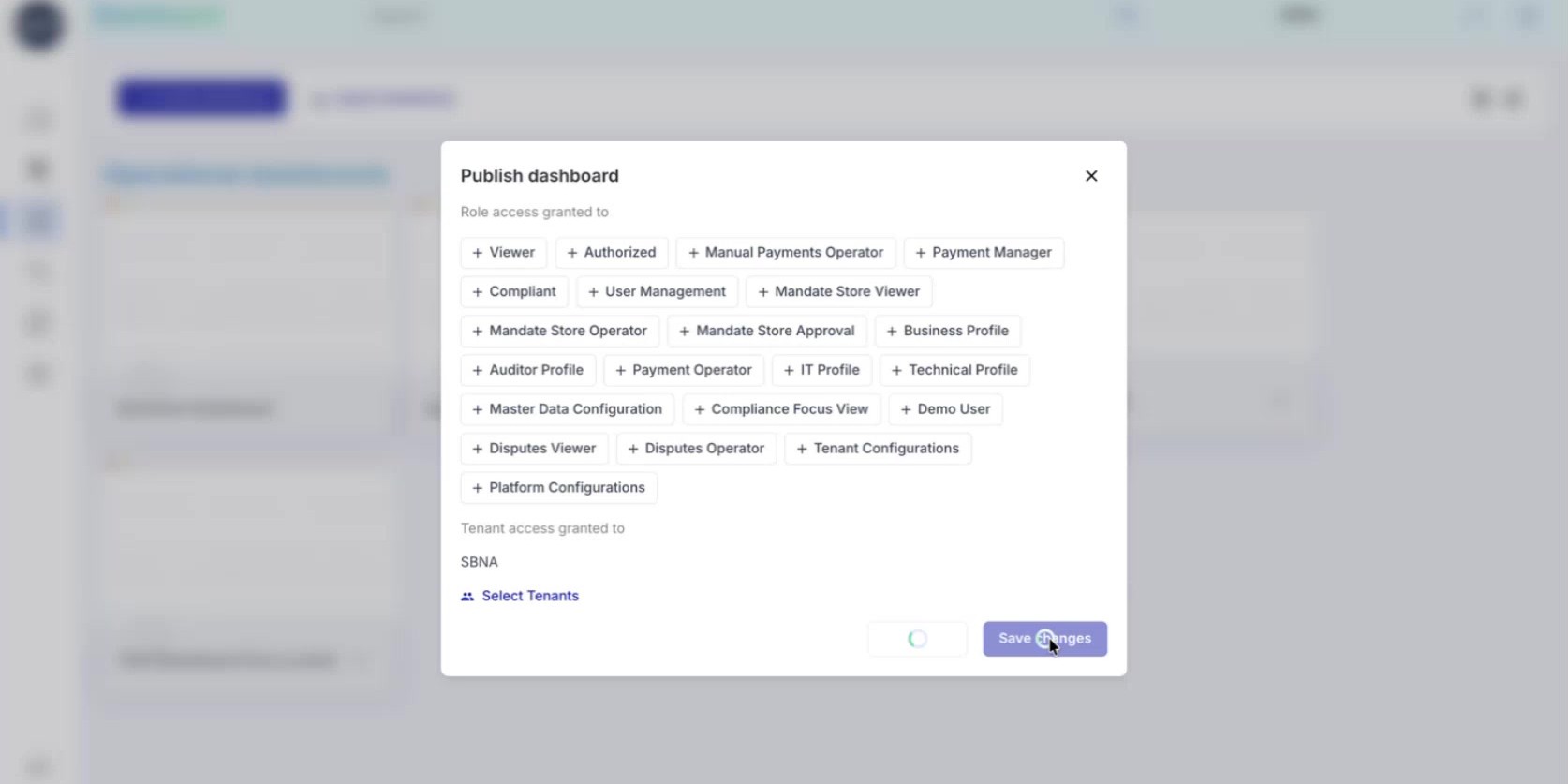
The Publish dashboard dialog displays all available roles in your system. Click on any role to toggle it — selected roles appear highlighted.
For example, you might publish to:
Tenant Configurations — other users who can also create dashboards
Demo User — a role used for client demonstrations
Payment Manager or Payment Operator — operational roles
You can select multiple roles to make the dashboard available to different user types.
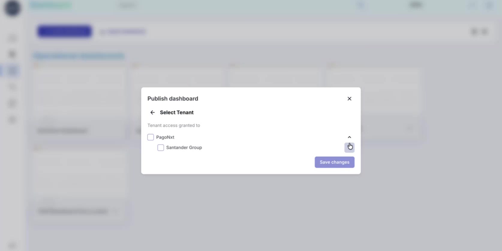
Step 4: Select Tenants
Below the roles section, click Select Tenants to choose which organizational units should have access. Select one or more tenants from the list.
The combination of roles and tenants determines exactly who can see the dashboard — only users with the selected roles AND associated to the selected tenants will have access.
Step 5: Save and Confirm Publication
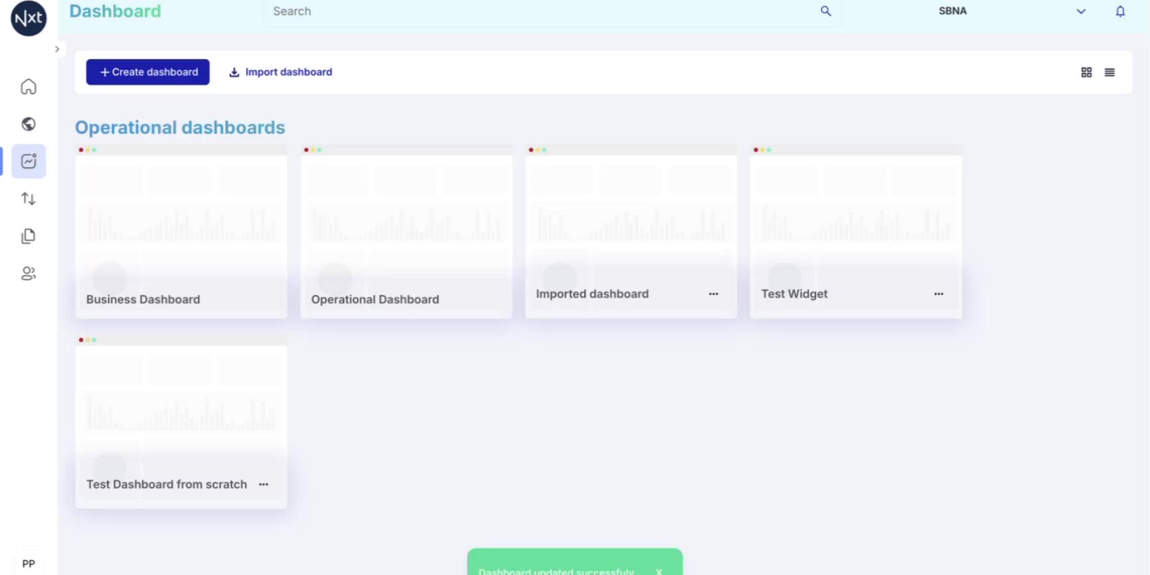
Click Save changes to publish the dashboard. From this moment, all users with the selected roles and associated to the selected tenants will be able to see the dashboard in their dashboard list.
The dashboard remains editable by you — publishing only controls visibility, not edit permissions.
Step 6: Edit or Unpublish a Dashboard
To change the publication settings or make a dashboard private again, click the three-dots menu (⋯) and select Edit publication.
The same dialog opens showing the currently selected roles and tenants. To unpublish, simply deselect all roles and tenants, then click Save changes. The dashboard will return to its private state, visible only to you.
Tip: You can partially unpublish by removing specific roles or tenants while keeping others selected.
Quick Reference
Step | Action |
|---|---|
1 | Dashboards are private by default — only you can see them |
2 | Click three-dots → Publish dashboard to open the dialog |
3 | Select the roles that should have access |
4 | Select the tenants that should have access |
5 | Click Save changes to publish |
6 | To unpublish: Edit publication → deselect all → Save changes |
Filters in Custom Dashboards
How to use dashboard-level and widget-level filters, set default filters for consumers, and resolve incompatible filter warnings.
Step 1: Open an Existing Dashboard
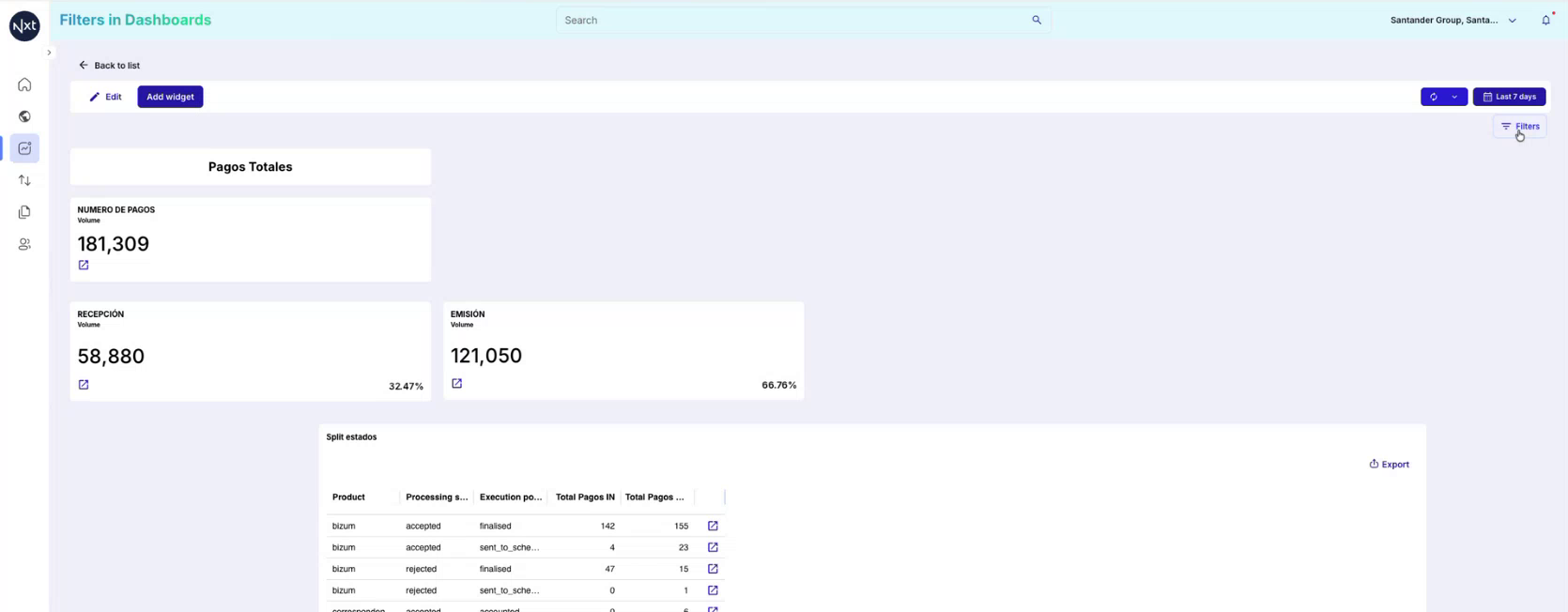
Open an existing custom dashboard. On the top-right area of the dashboard, you will see the new Filters button. This button allows you to apply filters that affect the entire dashboard.
Step 2: Open the Filters Panel
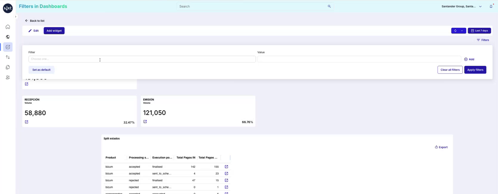
Click the Filters button to open the filters section. This displays a panel where you can choose any field from the data model to use as a filter. The Filter dropdown contains every filterable field available in the data model.
Step 3: Select a Filter Field
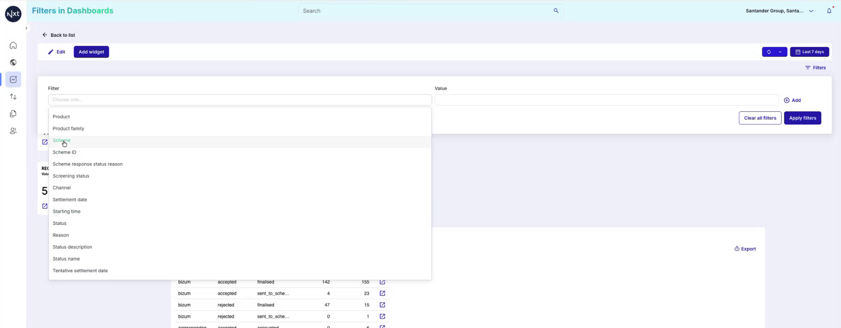
Click on the Filter dropdown to browse and select a field from the data model. For example, you can select Scheme to filter the dashboard by payment scheme. The list includes fields such as Product, Product family, Scheme, Scheme ID, Channel, Status, and many more.
Step 4: Choose Filter Values
After selecting a filter field, choose the values you want to filter by in the Value column. In this example, the values sct and correspondentbanks are selected for the Scheme filter. You can select multiple values for the same filter.
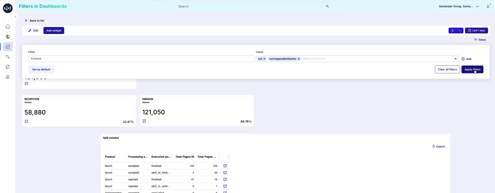
Step 5: Apply Filters and View Results
Once the filter values are selected, the dashboard data updates immediately to reflect the applied filters. A filter chip appears below the toolbar showing the active filter — for example, “Scheme is one of sct, correspondentbanks”. This chip provides a quick visual indicator of which filters are currently active.
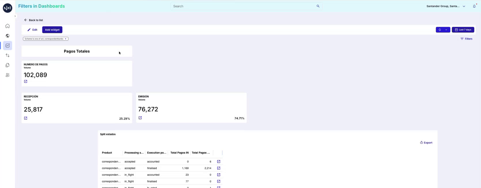
Step 6: Edit an Applied Filter
To edit an existing filter, simply click on the filter chip. This reopens the filters panel with the current filter field and values pre-selected. From here, you can modify the values, change the filter field, or remove the filter entirely.
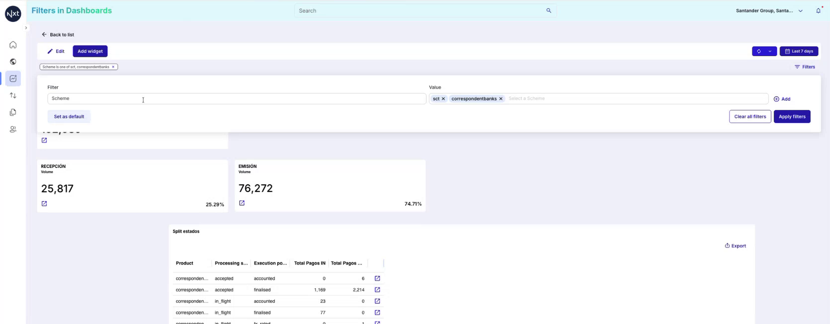
Step 7: Set Filters as Default (Dashboard Creator Only)
As the creator (editor) of the dashboard, you have the option to click “Set as default”. When you set filters as default and publish the dashboard, all consumers who open the dashboard will see these default filters applied automatically.
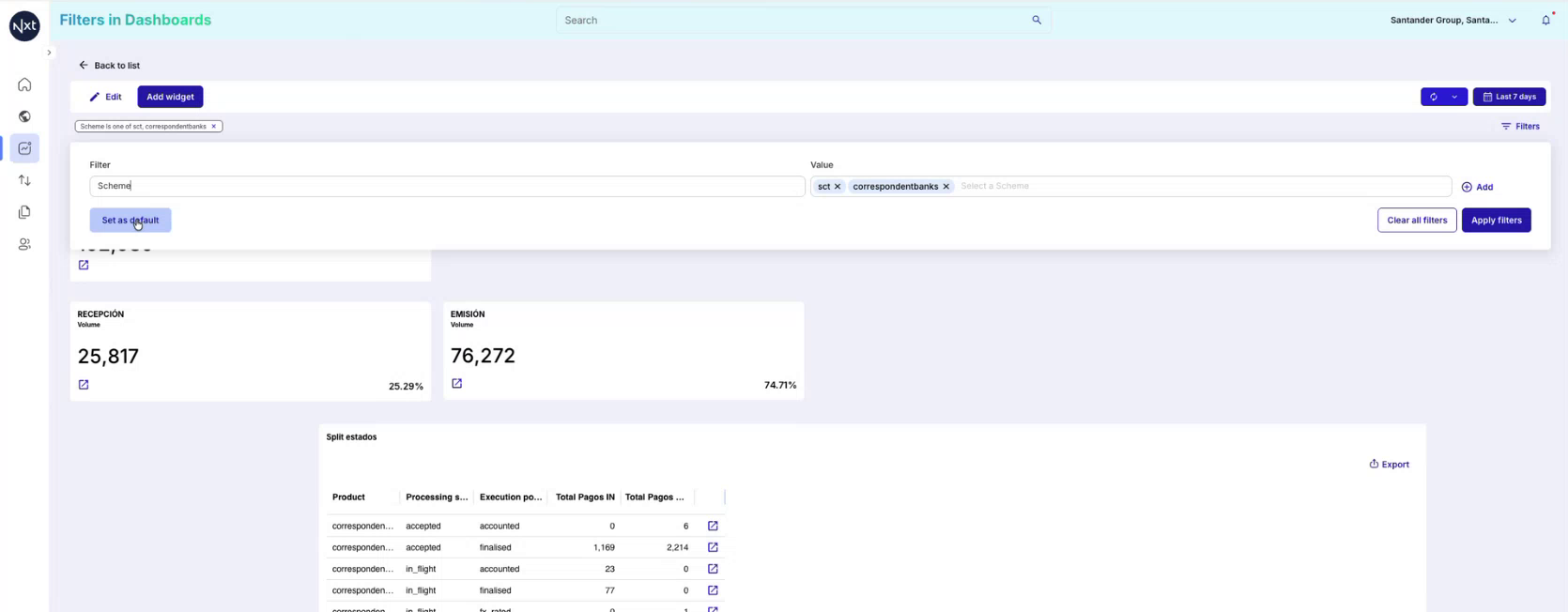
Step 8: Clear Default Filters
To remove default filters, clear all active filters and then click “Set as default” again with no filters selected. The next time the dashboard is opened, no default filters will be applied.
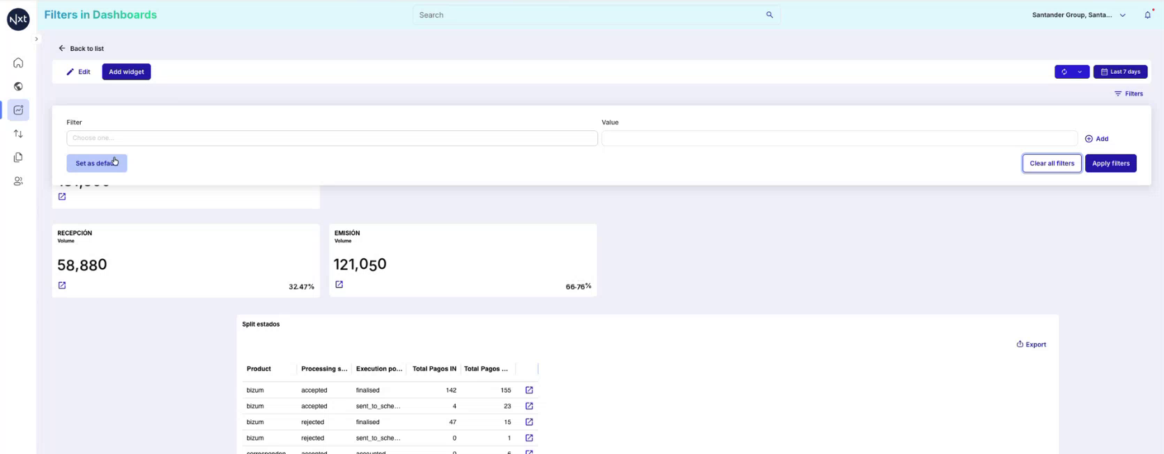
Step 9: Consumer Experience: Default Filters
When a consumer opens a dashboard that has default filters set by the creator, those filters are automatically applied. The consumer sees the filtered data as defined by the dashboard creator. However, consumers are free to change, remove, or add additional filters to customize their view during the session.
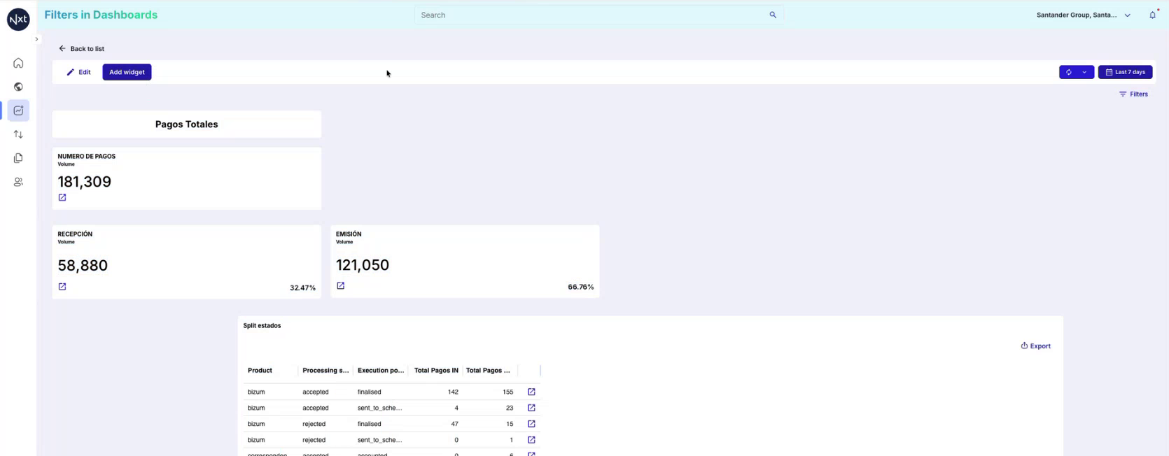
Step 10: Consumers Can Add Additional Filters
Consumers of the dashboard can add additional filters beyond the defaults. For example, a consumer could add a Message definition filter on top of the existing Scheme filter. These additional filters are session-specific — when the consumer leaves and returns to the dashboard, only the default filters will be applied again.
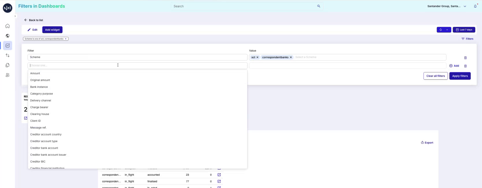
Step 11: Apply Additional Filters
In this example, the consumer has added a Message definition filter with the value pacs_008_v08 in addition to the existing Scheme filter. After clicking Apply, the dashboard data will be further narrowed to show only payments matching both filter criteria.
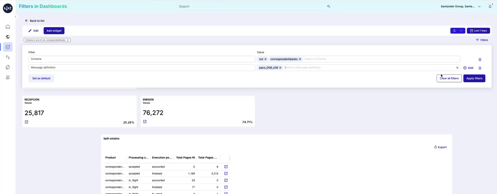
Step 12: Understanding Filter Levels: Dashboard vs. Widget
It is important to understand that there are two levels of filters in custom dashboards:
Dashboard-level filters — Applied via the Filters button at the top of the dashboard. These govern all widgets and data displayed across the entire dashboard.
Widget-level filters — Each individual widget (count cards, tables, bar charts) can also have its own filters. These are configured within the widget settings and can be used to apply additional, widget-specific filtering.
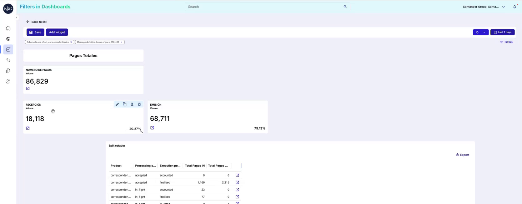
Step 13: Widget-Level Filter Configuration
When you open a widget configuration (e.g., a Count widget), you can see its Applicable filters section. Here you can define widget-specific filters. For instance, a widget named “Recepción” may already have a Flow filter set to “reception” to show only inbound payment data.
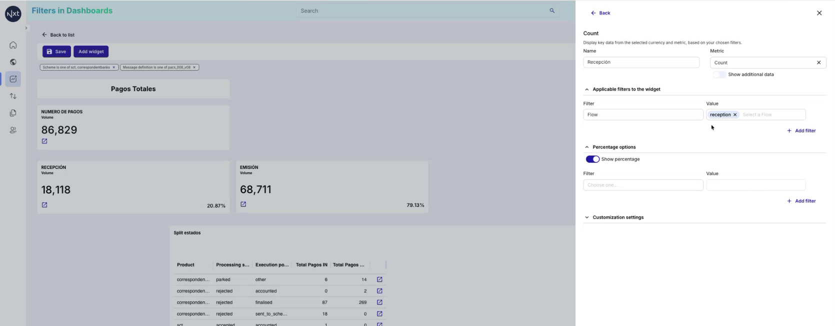
Step 14: Filters in Table Widgets
Table widgets also support their own filters. You can apply filters at the table level to further narrow the data displayed within that specific table, independent of the dashboard-level filters.
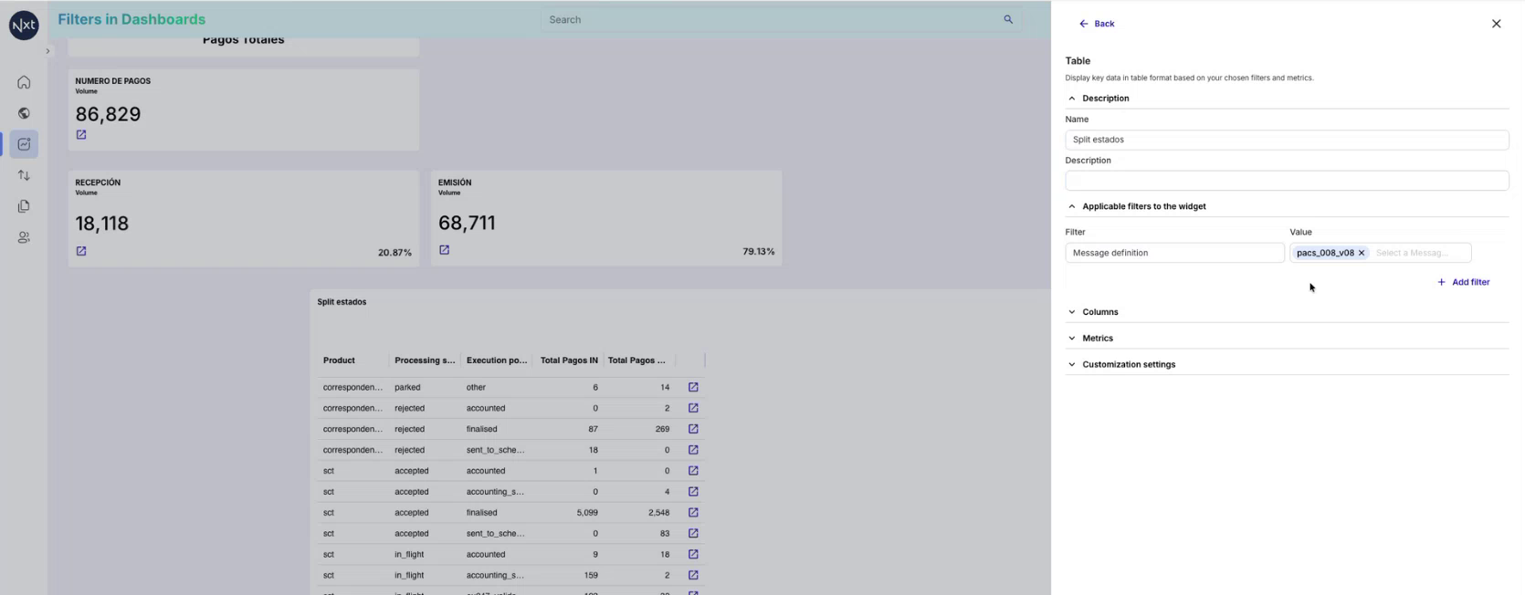
Step 15: Filters in Bar Chart Widgets
Similarly, bar chart widgets support widget-level filters. You can define specific filter criteria for each chart to control what data is visualized, in addition to the dashboard-level filters.
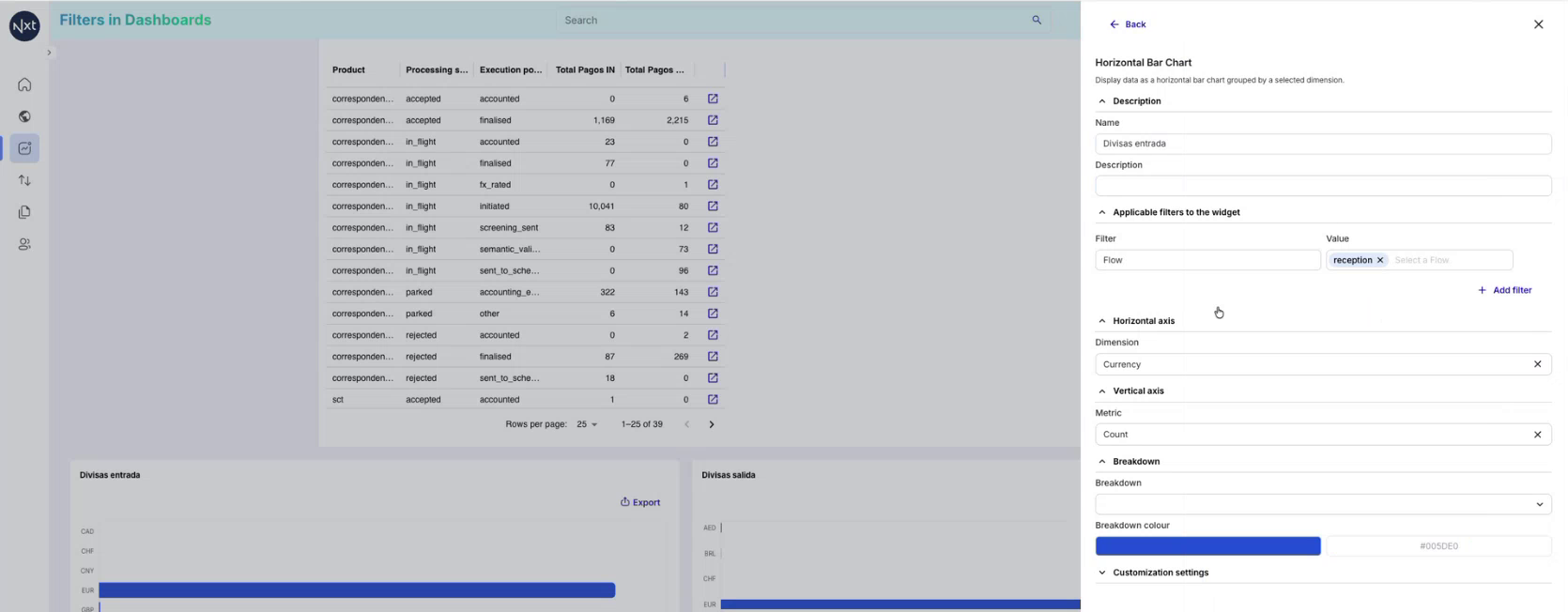
Step 16: Incompatible Filters Warning
When a dashboard-level filter conflicts with a widget-level filter, an “Incompatible filters” warning is displayed on the affected widget. For example, if a widget is configured to show only “reception” flow data but you apply a dashboard-level filter for “emission” flow, the widget will display: “Incompatible filters — The following filters are not compatible with this widget: Flow”.
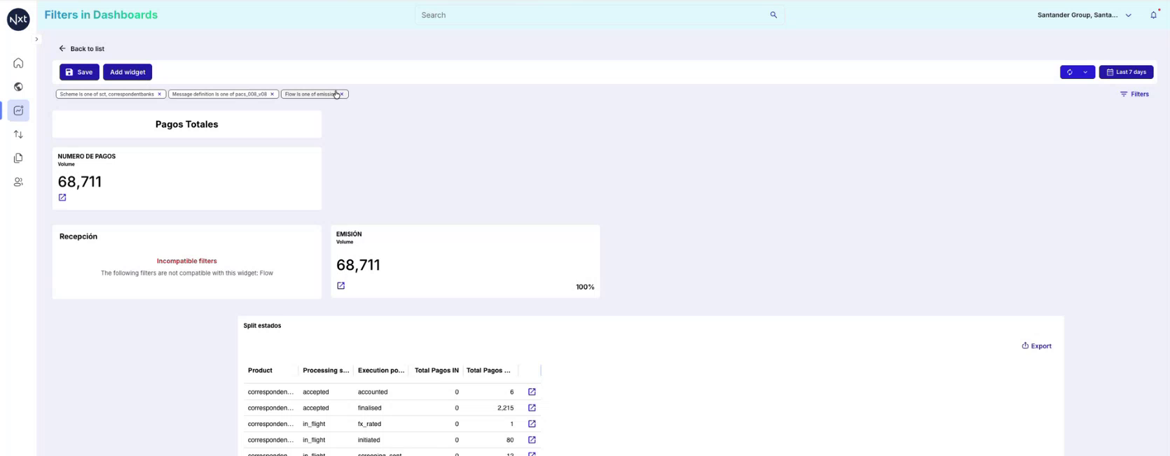
Step 17: Resolving Incompatible Filters
To resolve an incompatible filter warning, you can either:
Remove the conflicting dashboard-level filter, or
Remove or adjust the widget-level filter to make them compatible.
Once the conflict is resolved, the widget will display data correctly again.
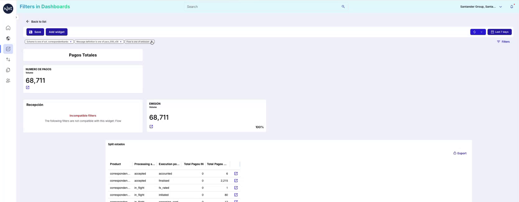
Important: Only the dashboard creator/editor can set default filters. Default filters define the initial view, but consumers can still modify or add their own filters on top.
Quick Reference
Step | Action |
|---|---|
1 | Open an Existing Dashboard |
2 | Open the Filters Panel |
3 | Select a Filter Field |
4 | Choose Filter Values |
5 | Apply Filters and View Results |
6 | Edit an Applied Filter |
7 | Set Filters as Default (Dashboard Creator Only) |
8 | Clear Default Filters |
9 | Consumer Experience: Default Filters |
10 | Consumers Can Add Additional Filters |
11 | Apply Additional Filters |
12 | Understanding Filter Levels: Dashboard vs. Widget |
13 | Widget-Level Filter Configuration |
14 | Filters in Table Widgets |
15 | Filters in Bar Chart Widgets |
16 | Incompatible Filters Warning |
17 | Resolving Incompatible Filters |
Key Takeaways:
Dashboard-level filters apply to the entire dashboard and affect all widgets.
Widget-level filters apply only to individual widgets (count cards, tables, charts).
Dashboard creators can set default filters that are applied automatically when consumers open the dashboard.
Consumers can add, modify, or remove filters during their session, but only the defaults persist between sessions.
If a dashboard-level filter conflicts with a widget-level filter, an “Incompatible filters” warning appears on the affected widget.
Filters provide great flexibility to analyze payments across multiple dimensions — by scheme, flow direction, message type, client ID, and more.
Manual Payment Creation
Manual Payment creation
When to create a Manual Payment?
Manual payment creation allows users to initiate payments directly within the platform when automatic processes are not applicable or a manual intervention is required. This feature ensures flexibility and operational control by enabling users to create payments that adhere to the organisation´s specific requirements.
Who can make a Manual Payment?
The ability to create a manual payment is governed by user roles and permissions. Only users with the necessary authorisation can access this feature of submit and approve or reject a payment.
How to make a manual payment?
In the right hand navigation, click on the ´Manual payment´button.
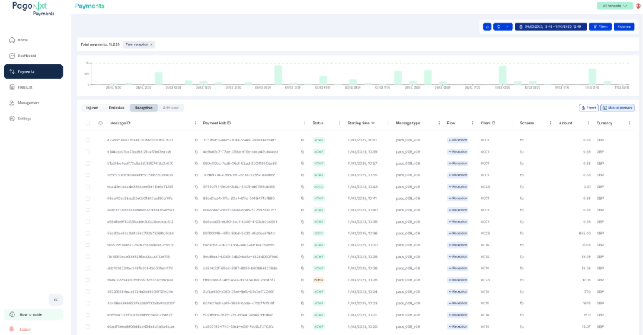
When you select this option, a screen will appear. To create a manual payment you should select an option from the three drop down lists:
Entity: the tenant you are sending the payment from e.g. Name of your organisation
Scheme: the scheme you want to create the payment in e.g. Faster Payments
Message: the type of message for the payment e.g. Pacs 008.
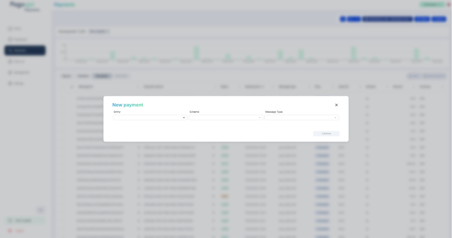
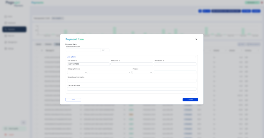
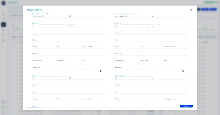
When you have completed this first step, a form with the ISO field will be generated to create a new manual payment where you will need to complete the information using the drop down lists and free text fields. Note: Please check the free text fields carefully before pressing ´continue´.
Exception Handling
Payments may need exception handling when they fail validation checks, experience processing issues, or require manual intervention for compliance or operational purposes. In such cases, the system will flag these payments as “injured,” indicating that they require attention before advancing further in the payment lifecycle.
Who can use the Exception Handler?
The actions available within the Exception Handler depend the user’s role and permissions within the system. Certain actions may be restricted to operators with specific authorisations.
Actions within the Exception Handler
When a payment is flagged as injured, users can take one or more actions depending on their permissions, the relevant scheme, and the specific issue affecting the payment. The following actions are supported by default and will be available according to the payment flow, whether it is outbound or inbound:
Authorise: Approve the release of a payment that is pending authorisation (4-6 eye check).
Release: Manually release a payment that was previously on hold or required additional validation.
What is the difference between authorize and release? Authorize requires a higher degree of authority. For example, payment will be authorized by a supervisor and will be released by an operator.
Reject: Permanently stop an outbound payment from being processed and notify the originator, typically used when there are compliance concerns or incorrect payment details.
Repair: To update the outbound payment with new data that will fix it. The fields that could be repaired are New Settlement Date, Category purpose and Remittance Information. Repair will start the orchestration of the payment from the beginning with the new data. For example, if the payment had done AML validation befor the repair, it will do AML validation again after the repair.
Reprocess: To continue the orchestration of the payment from where it was left, i.e. if the outbound payment had done fraud screening before being stopped because of incorrect interbank settlement date then it will not do fraud screening again.
Return: Generate an outbound payment to return a previous inbound payment. (see more information ´Understanding a Return payment´ below)
FX Input: Allows users to apply or modify foreign exchange (FX) rates for a payment, ensuring accurate currency conversion.
Accept / Reject Recall Request: Answer positively or negatively to a previously received cancellation request (camt.056)
How to take action
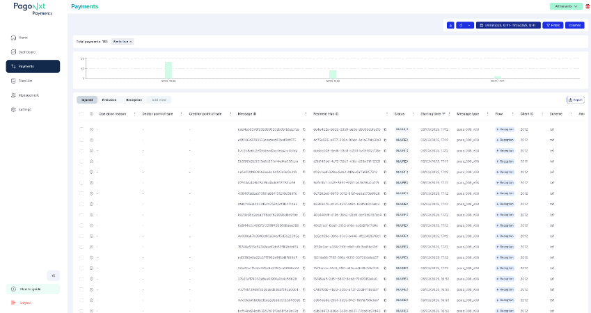
From the main navigation, select the Payments tab. click the ´Injured´ tab. A list of all injured payments will be displayed, filtered by urgency and issue type.
Select the Payment:
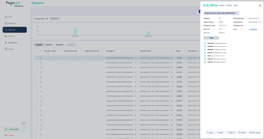
Click on a specific payment to view its details. A summary of the issue and available actions will be displayed.
Take the Necessary Action:
Depending on the payment issue, choose one of the available actions (e.g., Return, Retry, Redirect, Finalise). If modifying fields (Redirect), ensure that all mandatory fields are correctly updated.
Confirm and Submit:
Review the changes or action selected. Click the right hand button at the bottom of the screen to execute the selected operation. A confirmation message will indicate whether the action was successful or if further intervention is required.
.png)
Understanding a Return payment
When analysing a Return payment (pacs.004), you will not only view its details but also have the ability to navigate to the original payment it corresponds to.
As always, pressing the “More details” button will direct you to a display of all the data contained within the pacs.004.
.png)
This time a “Communication” button will appear. The “Communication” area will show you the corresponding pacs.008 message.
By clicking on the Payment Hub Id of the pacs.008 you will be able to navigate to the payment.
.png)
Understanding a Cancellation Request (camt.056)
In some payments rails such as SEPA Credit Transfer. A Cancellation Request (camt.056) for a previous Payment (pacs.008) can be answered with Return (pacs.004). In the Customer Portal you will be able to see all three messages and how they relate to each other.
.png)
In the communication area you will be able to navigate through Cancellation Request (camt.056) and if available, its related Return (pacs.004).
Managing Users
Audit and Compliance
All actions performed within the Exception Handler are meticulously logged for auditing purposes. Users can monitor changes, approvals, and rejections in the Audit Section of the payment details view. This process guarantees transparency and accountability in managing payment exceptions.
The Exception Handler is an essential feature that ensures payments are processed efficiently while upholding compliance with both operational and regulatory standards.
Add a User in the Customer Portal
Only users with a 'User Management' profile can grant access to the Customer Portal. To identify who holds the User Management profile within your team, please consult your Getnet Platforms Implementation Manager.
Users with Management permissions can add new users by:
· Clicking on the 'Management' icon in the left-hand navigation
Note: The Management icon will only be visible to those with a User Management profile.
· Selecting 'Add New User' in the top right-hand corner
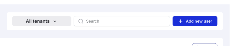
· From the All tenants drop down, select the tenants where you want to assign the new user to:
· Enter the email of the user, and click Confirm
Mandates
Use the Mandates section to search, create, update, cancel, activate, delete, and approve payment mandates in the Operations Portal. Access and available actions depend on the role assigned to the user.
Availability The Mandate Store menu is shown only to users whose assigned roles grant access to the mandates functionality. |
Roles and permissions
Role | Access | Available actions |
Mandate Store Viewer | Mandate Store | View mandates only. |
Mandate Store Operator | Mandate Store | Create, edit, cancel, activate, and delete mandates, depending on mandate status and scheme. |
Mandate Store Approval | Mandate Review | Review pending mandate changes and approve or reject them. The approver must be different from the user who requested the action. |
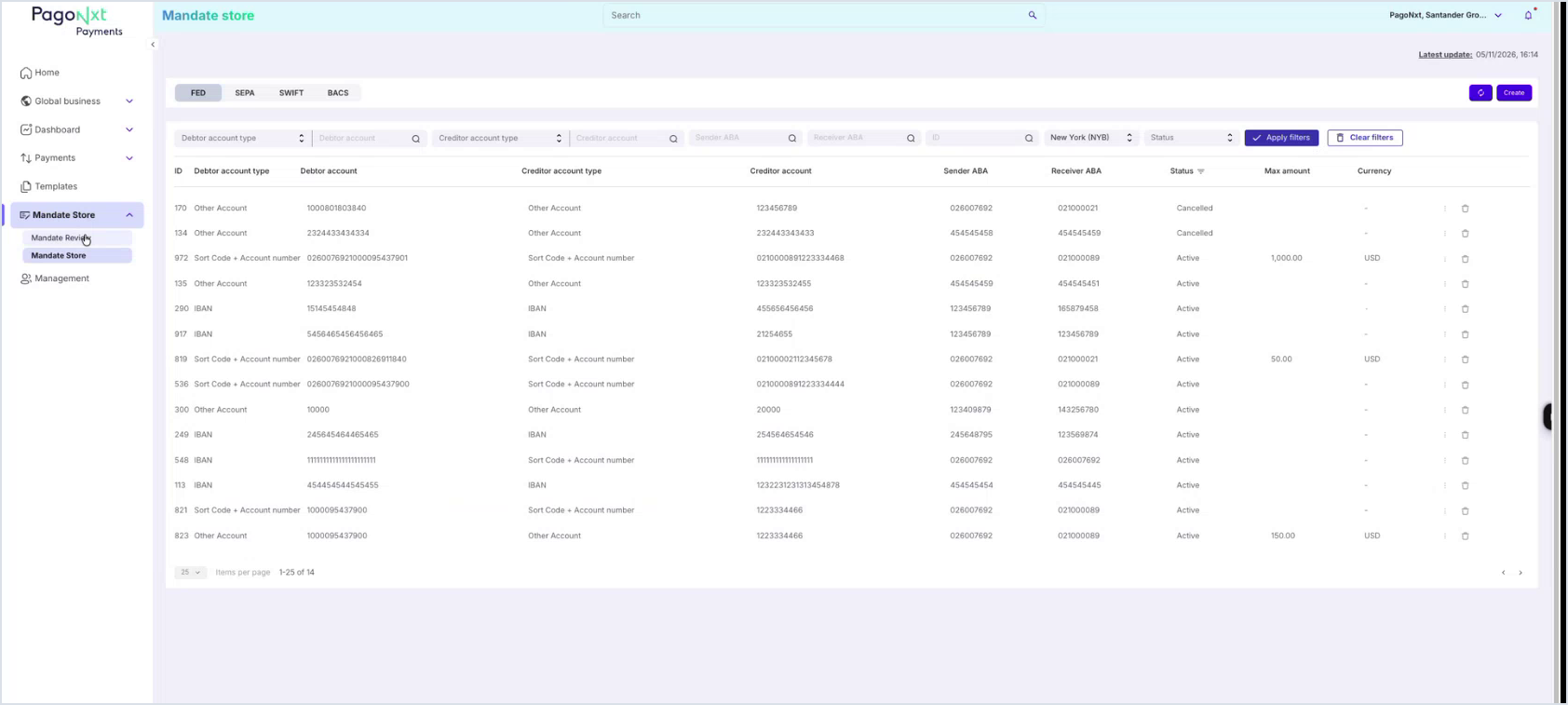
Access Mandate Store
1. Open the main menu and expand Mandate Store.
2. Select Mandate Store to open the mandate list, or Mandate Review to manage approvals.
3. Choose the payment scheme tab: FED, SEPA, SWIFT, or BACS. Each tab displays its own columns and filters.
Search and filter mandates
The mandate list includes filters above the results table. The available filters change according to the selected scheme. Common examples include debtor account type, debtor account, creditor account type, creditor account, sender or receiver identifier, tenant, status, and mandate ID.
1. Enter or select the criteria to apply.
2. Click Apply filters to update the result set.
3. Click Clear filters to reset the filter bar.
4. Use the pagination controls at the bottom of the table to move across result pages.
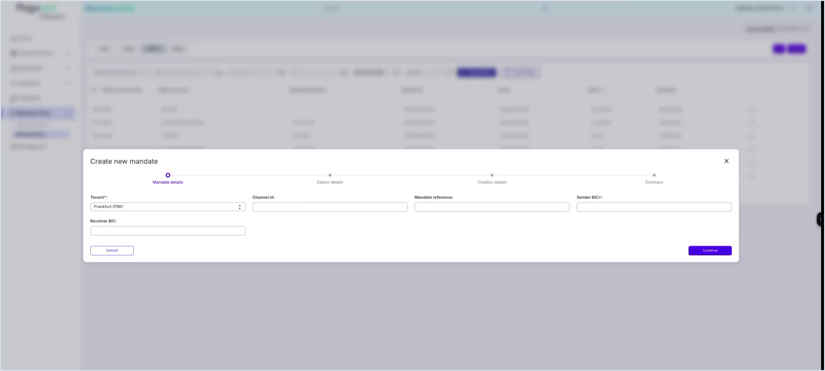
Create a mandate
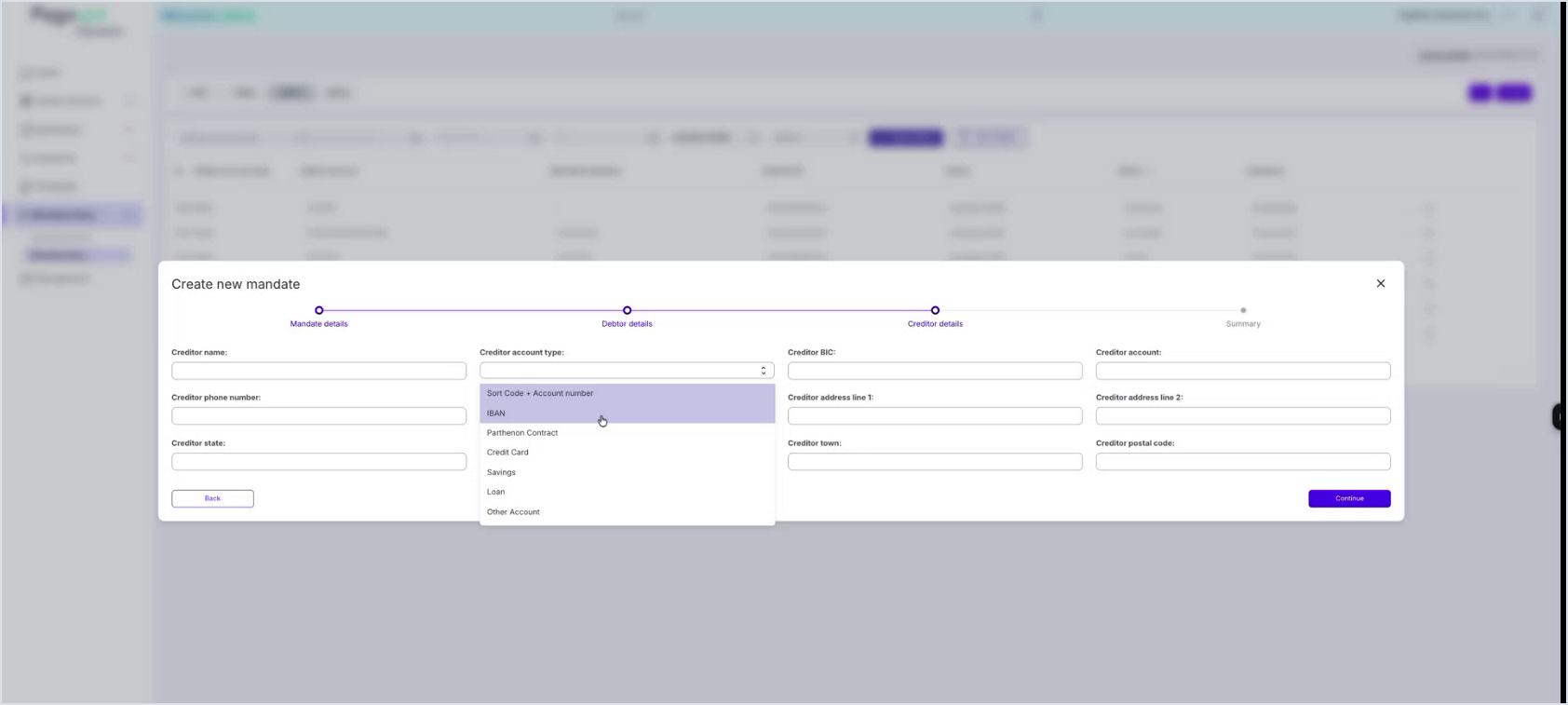
Users with the Mandate Store Operator role can create a new mandate from the selected scheme tab. The creation flow is displayed as a stepper. The Continue button becomes available as the mandatory fields for the current step are completed.
Step | Description |
Mandate details | Enter mandate-level information such as tenant, channel ID, mandate reference, sender BIC, and receiver BIC. |
Debtor details | Enter debtor account and contact or address details required by the selected scheme. |
Creditor details | Enter creditor account and contact or address details required by the selected scheme. |
Summary | Review the information before submitting the new mandate. |
1. Open Mandate Store and select the required payment scheme tab.
2. Click Create.
3. Complete the mandatory fields in each step.
4. Review the Summary step before submitting the mandate.
View mandate details and audit information
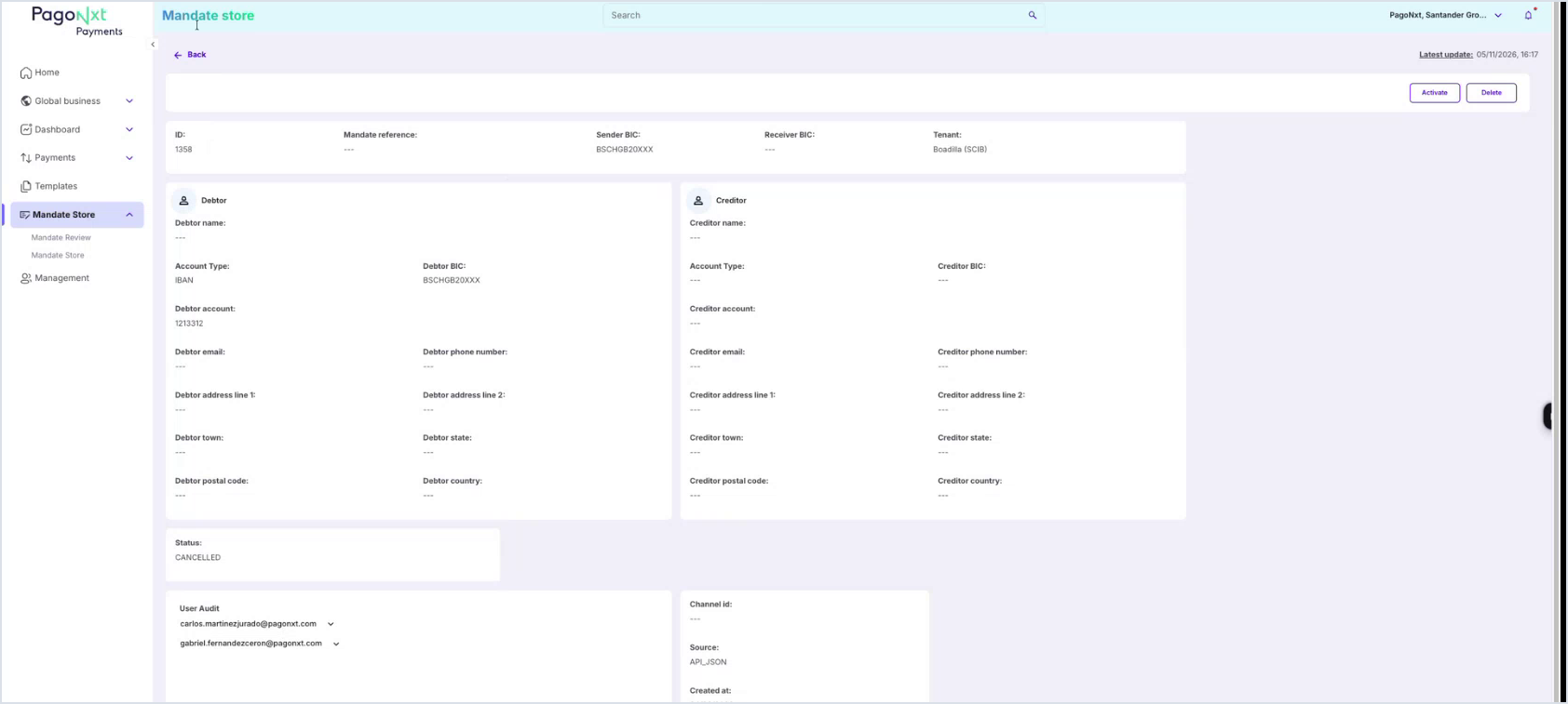
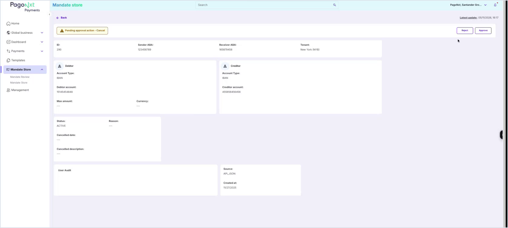
Select a mandate from the results table to open its detail page. The detail view shows the mandate identifiers, tenant, debtor and creditor data, current status, source, creation date, and user audit information.
Section | Description |
Mandate identifiers | Mandate ID, mandate reference, and related scheme identifiers. |
Debtor and creditor data | Account, contact, and address information associated with the mandate. |
Status and source | Current mandate status and source of creation or update. |
Audit information | Users and actions related to the mandate lifecycle. |
Actions from the detail page
Depending on the user role and mandate status, the detail page can display actions such as Activate and Delete. From the table row action menu, operators can also access actions such as Edit, Cancel, Activate, or Delete.
Review pending mandate changes
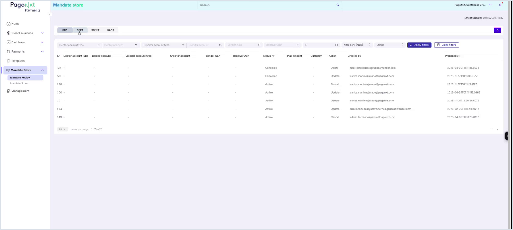
Users with the Mandate Store Approval role can use Mandate Review to access mandates with pending approval actions. The review list is separated by the same scheme tabs and includes filters so reviewers can narrow down pending items.
1. Open Mandate Store > Mandate Review.
2. Select the relevant scheme tab.
3. Use the filters to find a pending request.
4. Open the request detail and review the proposed action and mandate data.
5. Click Approve or Reject. The user who approves or rejects must be different from the user who requested the action.
Mandate lifecycle actions
Action | Where it is available | Result |
Create | Mandate Store scheme tab | Starts the mandate creation stepper. |
Edit | Mandate Store table row menu | Submits an update request when approval is required. |
Cancel | Mandate Store table row menu | Submits or performs a cancellation action according to permissions and status. |
Activate | Mandate detail page or table row menu | Reactivates a mandate when allowed. |
Delete | Mandate detail page or table row menu | Deletes or submits deletion for approval when allowed. |
Approve / Reject | Mandate Review detail page | Completes or rejects a pending requested action under the four-eyes approval control. |
Four-eyes approval control
Some mandate actions may require approval before they are completed. When approval is required, the requested action is displayed in Mandate Review and must be approved or rejected by a different authorised user. This ensures sensitive mandate changes follow a four-eyes approval process.
Logging Out
To log out click the ´Logout´ icon at the bottom of the left hand navigation panel. The portal will automatically log out after 30mins if there has been no activity.
.png)